This blog will be posted on Election Day, which marks the end of the election period. It is estimated that more than half of voters had already cast their vote before today. This evening, I and many million others will be glued—probably not to our televisions but to our mobile phones, checking the trending results. Today’s blog, and probably next week’s, will try to understand two key elements of the process that we are all going through. The first issue is the role of gender and college education in the process and the second issue is the dynamics of the spatial distribution of the electorate.
A recent article in the New York Times (NYT) piqued my interest in the role of gender and college education. The article was based on a Pew Research survey of US adults conducted from September 30 to October 6, 2024 which polled different voting groups and came out with the following result (in percentage differences):
Non-college-educated men – Trump +16
Non-college-educated women – Trump + 4
College-educated men – Harris +7
College-educated women – Harris + 27
Below is a key paragraph from the NYT about these numbers:
We are truly looking at two different Americas when we dig into the views of men without college degrees and women with college degrees. They are at opposite ends of the spectrum politically and experience essentially separate economies, and therefore give priority to distinct sets of character traits and issues.
The NYT article says these results describe the behavior of two different countries: non-college-graduate men and women college graduates. The numbers indicate relative polling numbers but not the impacts these groups will have on final results. The impact on the final results can be estimated from the weight of these two groups in the general voting population. We can get an approximation of the total numbers from the labor force estimates from the same Pew source shown in Figure 1. The total number of eligible voters in the US 2024 election is 186 million. The voting percentage in the last presidential election (2022) was 66%, which amounts to 124 million voters. The number of the labor force described in Figure 1 is 144 million. If the trends described above are representative, putting these numbers in, we get the following split:
Non-college-educated men – Trump – 7.5M
Non-college-educated women – Trump – 1.5M
College-educated men – Harris – 2.1M
College-educated women – Harris – 8.5M
The net difference is 1.6 million in Harris’ advantage. This kind of estimate is no better than the rest of the polling that was addressed in last week’s blog. However, if schools want to have an impact on the political environment, it might well be more effective for their survival and that of the country to enhance recruiting efforts in populations where they currently have minimal impact.
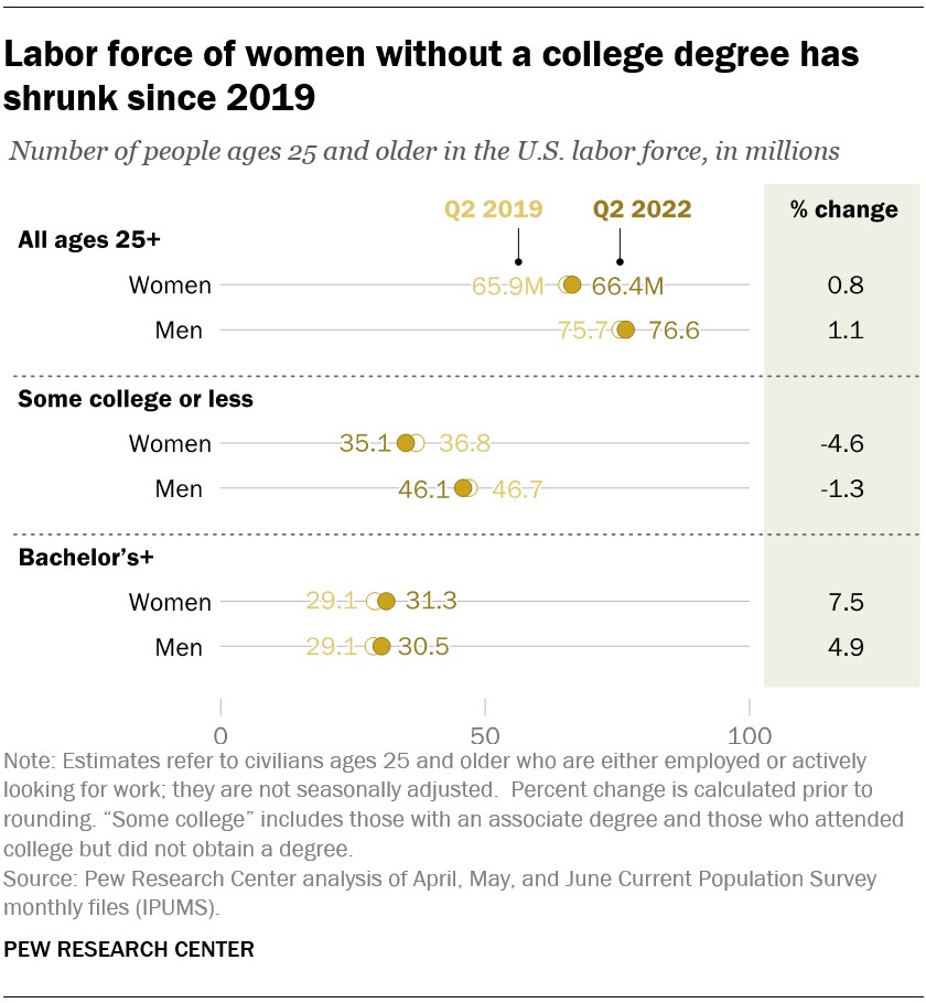
Figure 1 (Source: Pew Research Center)
The second issue that I will address in this blog is the dynamics of the spatial distribution of the electorate. I have tried to address this issue in previous blogs that, like this one, were posted in close proximity to previous presidential elections. I posted two good examples back to back following Ex-president Trump’s first election win in 2016.. The first one is titled “Election and Urbanization” (December 6, 2016), and the second one is titled “The Urban/Rural Voting Split: a Global Perspective (December 13, 2016).
Figure 2, taken from the December 6th blog (the original reference is posted there), shows how voting depended on population density in the 2012 presidential election. Figure 3 shows the actual distribution in the state of Pennsylvania (the largest swing state in the present election) in the most recent 2020 election.
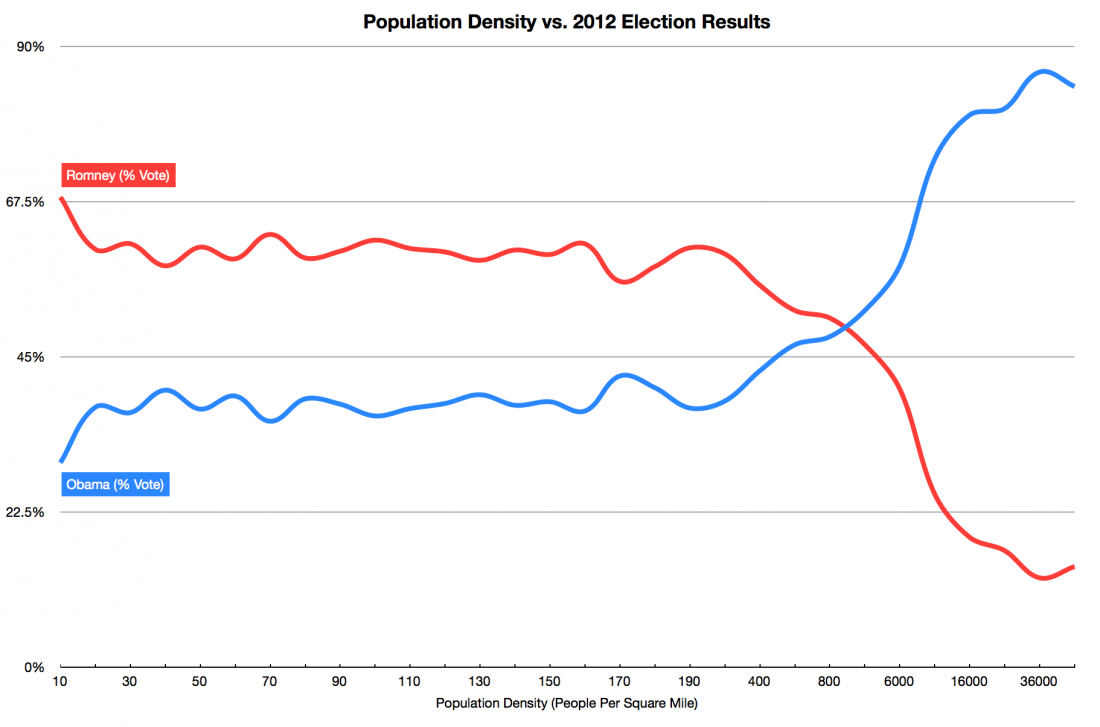
Figure 2 (From the December 6, 2016 blog)
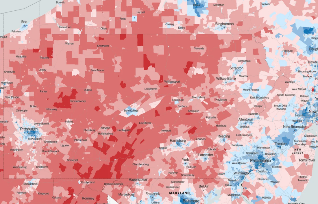
Figure 3 – The Pennsylvania 2020 voting distribution (Source: Reddit)
We clearly see the Democratic blue distribution on the Eastern part of the state dominated by Philadelphia and the dominant red in the rest of the state, with blue islands in cities such as Pittsburgh, Allentown, Reading, Erie, and Scranton.
Until recently, The global and US trends showed most of the population movement flowed from countrysides to urban areas. Figure 4 shows the recent trend in the US. Based on these trends, one might think that the Democrats would be certain to win all the coming elections.
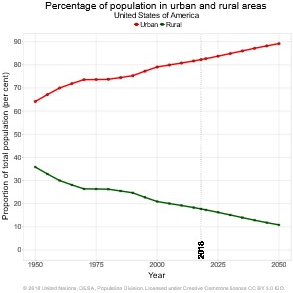
Figure 4 – Evolution of US urban/rural populations (Source: UN)
However, recent trends in the US show a reverse in movement. Figure 5 shows recent movements from big cities such as NYC, LA , San Francisco, Chicago, Boston, and Miami to less populated areas. The next blog will try to explore this development and connect it to the concept of entropy (just put the word in the search box to reintroduce yourself to our previous uses of the concept).
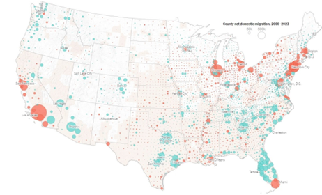
Figure 5 – American interstate movements (Source: NYT)
