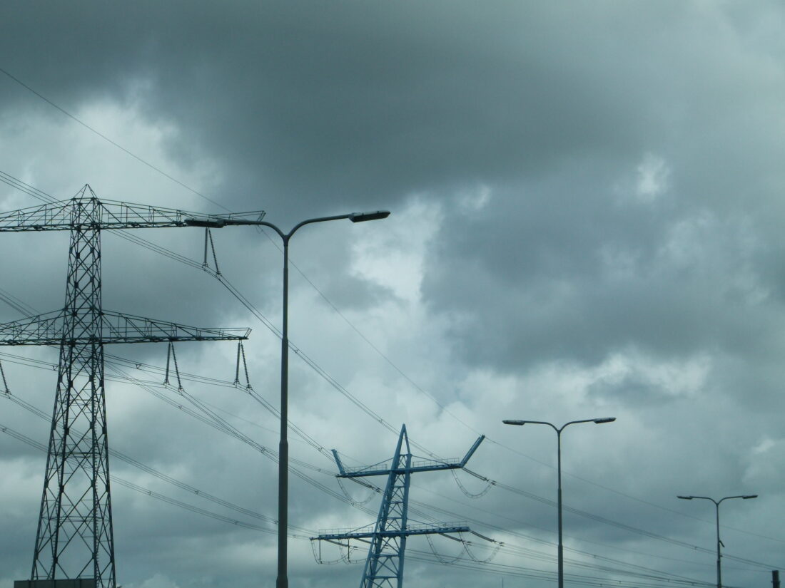
Power lines in the Netherlands with a dark cloud cover (From September 5, 2023, “Utility Pricing”)
Happy Earth Day and happy birthday to both my wife and this blog. Climate Change Fork is now 12 years old!
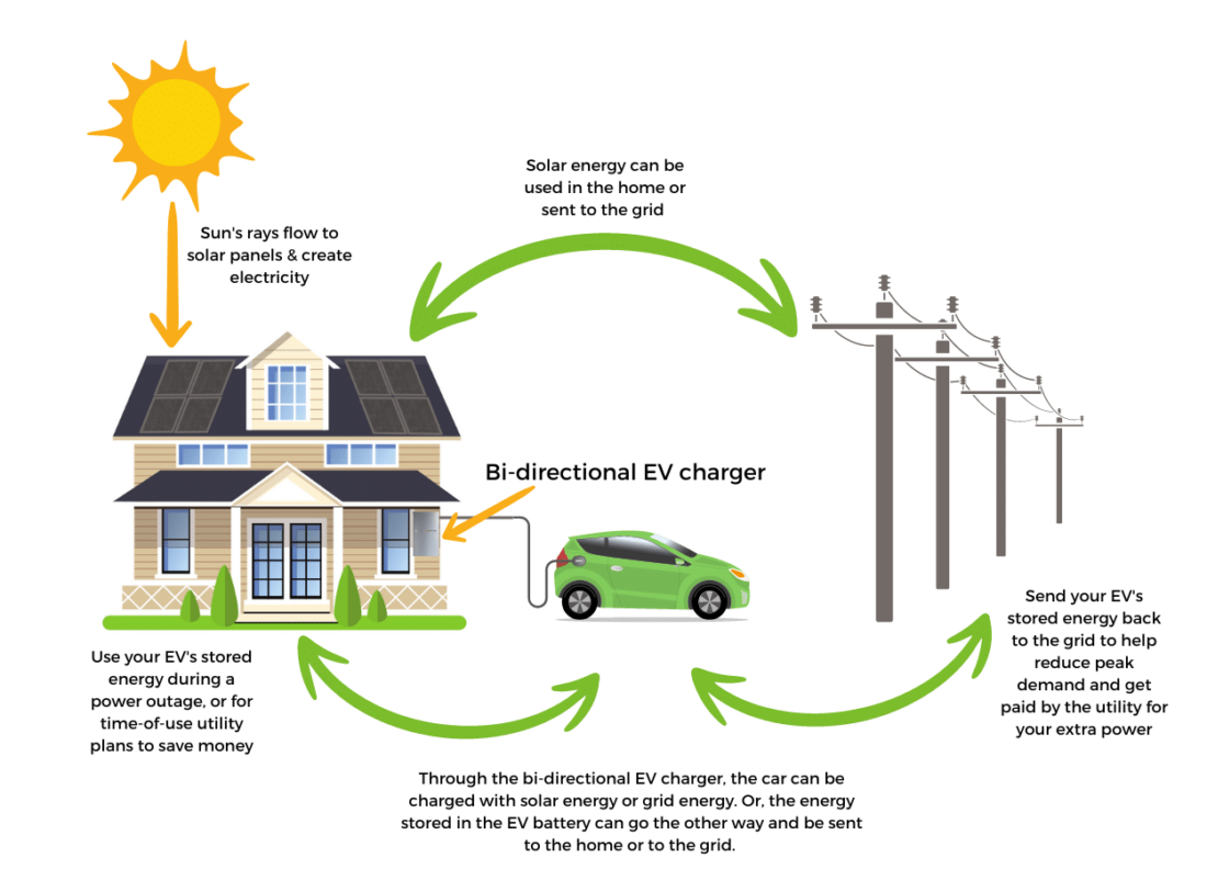
The top figure and Figure 2 of this blog are carry-overs from previous blogs that dealt with different aspects of modern power grids. A simpler example based on bi-directional interactions of a single home with central utility was shown and discussed a month ago (March 26, 2024) when I started the discussion on net metering. The price and resilience of smart grids are becoming central issues both in rich countries and developing countries.
An example of the need for security resiliency was mentioned in a recent article in the NYT from which I am citing two key paragraphs:
When power stops, life grinds to a halt. Lights go out. Sewage treatment stops. Clean water stops. Electric cars, buses and trolleys stop. Elevators stop, trapping older and disabled people. For many, home heating, refrigeration, cooking and clothes washing stops, along with medical devices such as oxygen generators.
Even though the world’s dependence on electricity for all of this and more is growing, power grids are still legitimate military targets, according to both international law and our own military rule book. But there are small, promising signs that could be changing. Early last month, before Russia’s most damaging assaults, the International Criminal Court in The Hague concluded that the country’s pummeling of Ukraine’s power system had already crossed the line and issued arrest warrants for a pair of senior Russian commanders, Adm. Viktor Nikolayevich Sokolov and Lt. Gen. Sergei Ivanovich Kobylash, whose units are accused of launching the missiles. (Russia has denied committing war crimes.)
Electric grids are now playing an increasingly important role in all aspects of our lives, and as a result, we are more vulnerable to security threats from actors who want to do us harm. In addition, there is now the relatively recent and increasing danger of catastrophic weather impact that plays a central role globally. An important solution can involve burying the high-voltage lines in the ground. National Grid provides a review article, with some concrete examples.
Electricity pricing mechanisms in the US are summarized below:
In the “old days” prior to some of the organizational changes brought about by the FERC actions, electricity prices were often set by utility companies and approved by state utility commissions. The rates were often determined based on the concept of cost recovery. The more that the utilities spent on infrastructure and generators for production, the more returns could be “justified.” Those returns were, for the most part, set as a percentage of the total approved investment cost (rate base). While these types of returns provided limited risk for utility investors, from a consumer’s perspective, there was too little incentive for efficiency and conservation activities that would serve to lower consumer prices.
The FERC has tried to provide that incentive by requiring segmentation of the business operations of electrical distribution, transmission, and generation, even if those operations are performed by the same corporation. The purpose for this segmentation is to take the financial risk of constructing expensive generators off the electric consumer and place that risk on the shoulders of investor-owned corporations. For instance, Exelon, a very large utility company in the United States, owns generators, grid transmission equipment, and distribution companies that distribute electricity to individual consumers (e.g., PECO, ComEd). However, the FERC requires Exelon and other similar organizations to create organizational-structural-financial barriers within their companies. In practice, these companies are barred from sharing operational information between their generation portfolio and their transmission portfolio. This division is intended to ensure that everyone who uses the grid is treated fairly and doesn’t have an advantage, one over another. And that’s really where competition comes into play, because as the generator businesses compete for a share of the electricity market, competition drives down the cost of electricity for all consumers.
https://www.ferc.gov/ Federal Energy Regulatory Commission
FERC will update their guidelines shortly (May 13th):
April 19 (Reuters) – The U.S. Federal Energy Regulatory Commission (FERC) will announce on May 13 its plan to speed up the development of long-distance transmission lines to meet rising power demand and bring a backlog of planned clean energy projects to the grid.
The long-awaited plan is part of reforms to upgrade the country’s aging electric transmission system to keep up with power demand and a shift from fossil fuels to renewable energy.
A schematic diagram of a smart grid, compatible with the requirements of the energy transition anchored on sustainable energy sources, was described in a previous blog and is shown again in Figure 2 below:
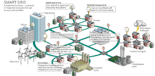
Figure 2 – Schematic diagram of energy distributed through a smart grid and microgrids (From July 14, 2020, “School Energy Use: Smart Grids”)
It is obvious that this transformation is going to be expensive, and the question that is always raised is who will pay the price. It should also be obvious that now with the almost global transition to electricity, power should be available to both rich and poor countries. It is also clear that these issues are political and that they should be solved with global broad agreement.
One particular approach to address the equity issues in power distribution is being tried in California, as I described in the April 9th blog:
The controversial plan to require California’s three biggest utilities to start charging their customers based on how much money they make has been shelved by state regulators — at least for now.
Instead, the California Public Utilities Commission is proposing a less radical — if not necessarily less controversial — approach to complying with a state law demanding that it examine new rate structures to reduce the burden of rising electricity rates, a problem that will only deepen as the state further embraces electrification.
That proposal? Reduce per-kilowatt-hour rates but institute a fixed charge of $24.15 per month for most customers of utilities Pacific Gas & Electric, Southern California Edison and San Diego Gas & Electric.
The more general situation in the US was summarized by AI (through Google) and is shown below:
The US federal government has provided $145 billion in subsidies to support energy research and development (R&D) for nuclear power and fossil fuels since 1950. In 2016–2022, 46% of federal energy subsidies were for renewable energy, while 35% were for energy end uses. In 2022, households could receive a tax credit of up to 10% to cover the cost of insulation materials and other energy efficient improvements, such as energy-saving windows and doors. They could also receive a $300 tax credit for purchasing efficient heating and cooling equipment.
The essence of the AI description comes from an EIA (Energy Information Administration) report titled “Federal Financial Interventions and Subsidies in Energy in Fiscal Years 2016–2022.”
I will wait until I read the new FERC report on the issue and start next week’s blog addressing the international aspects of these issues. Specifically, how developing countries hope to generate the resources to finance the transition. Without their cooperation, the energy transition is bound to fail and all of us will suffer the consequences.
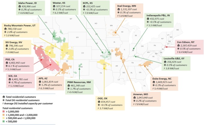 Figure 1 – Characteristics of 16 distributed generation utilities in the US (Source: