Happy New Year
2021 was not a great year. We are all hoping that 2022 will be better but I doubt that will be the case. I do think, however, that we will be up to the challenges it brings.
Most of the challenges of 2021 fell under two categories of global disaster: the COVID-19 pandemic and anthropogenic climate change. I expect that the pandemic will eventually downgrade to epidemic status and that by then we will have the tools to fight it wherever it rises. Conversely, I expect the impact of climate change to get worse, with no end in sight to its impact. We have the tools to fight it, too, but our global commitments to use them are in question.
The last two months of 2021 reflected these two massive issues: due to the COP26 meeting, much of the news in November focused on climate change; December news, on the other hand, focused on COVID-19 and the emergence of the new omicron variant.
Parallel to these two disasters, another major global change emerged in the news—one that will require more and more of our attention in the coming years—population transition: fertility rates and birth rates are decreasing globally. There are a growing number of countries whose fertility rates have fallen below replacement value (around 2.1). All of this strongly suggests that soon the world population will reach its maxima even as it tends toward a shrinkage: a sort of “it gets worse before it gets better” situation, depending on your definition of “worse” or “better.” These trends result in major changes in population pyramids, decreasing the number of younger people—and the size of the workforce (roughly ages 20–65)—and increasing the number of older people.
I addressed these issues about eight years ago. You can refer to the series of blogs from December 2013 through February 2014 if some of the terms that I used in the last paragraph are unfamiliar. You will find detailed explanations with data for that period. The series of blogs includes a guest blog written by Jim Foreit (January 14, 2014), a professional demographer who actually knows what he is talking about.
This blog, and the one that will follow next week, should be considered as updates to the 2014 series. It will consist of a few recent links that indicate the accelerated pace of the global demographic transition, as well as a series of recent maps of birth and fertility rates by country.
Stacker has a decent anecdotal summary of the global demographic changes currently taking place.
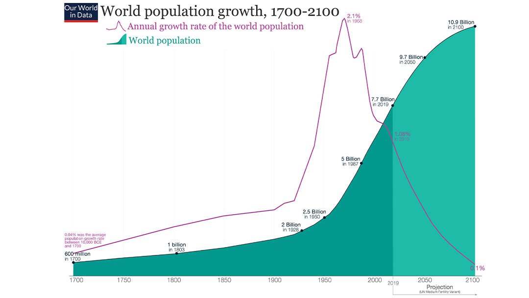
Figures 1–3 describe the current global birth and fertility rates, in addition to population and annual population growth from 1700 until the end of the current century. The seriousness of the situation is reflected in the somewhat unusual voice of the Pope:
In his weekly address in front of St. Peter’s Basilica on Sunday, the Pope expressed his disappointment in Italy’s falling birth rate, or as he called it – a “demographic winter.” The Pope framed the country’s birth rate – which hit its lowest level last year since the nation’s 1861 unification – as a threat to its future wellbeing. “It seems that a lot of people have lost the wish to have children,” he said. “Lots of couples prefer to remain childless or to have one child only…It’s a tragedy…which runs counter to our families, our country and our future.” The ongoing pandemic appears to have added a new contributing factor to the country’s century-long population decline, which has continued into this year.
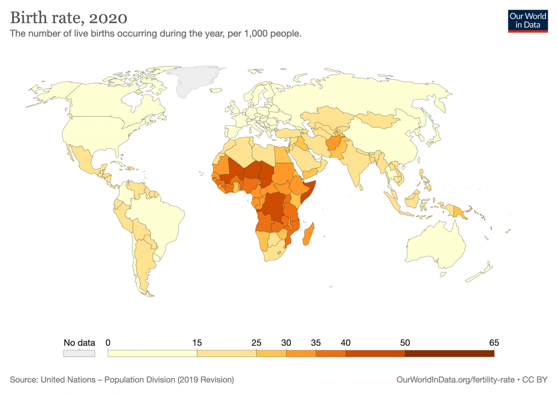
Figure 1 – Countries by birth rate in 2020
By Korakys – Own work, CC BY-SA 4.0, https://commons.wikimedia.org/w/index.php?curid=92951369
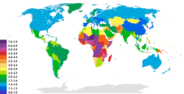
Figure 2 – Map of global fertility rate
Data sources: Our World in Data based on HYDE, UN, and UN Population Division (2019 Revision). Licensed under CC-by the author Max Roser.
Figure 3 – World population growth and annual global population growth
Other voices that emphasize various aspects of the transition are given below:
The Economist examines the acceleration of the transition.
WION gives predictions for population maximum before the end of the century: “Currently, there are about 7.8 billion people in the world. The study has predicted that the peak in the global population would expectedly be around 9.7 billion in 2064 and then decline to 8.79 billion in 2100.”
MedicalXpress.com posits a correlation between fossil fuel use and fertility:
Chemical pollution from burning fossil fuels could play a significant part in global decline in sperm counts, a fresh study finds.
An in-depth analysis in the journal Nature Reviews Endocrinology says “industrialized regions now have rates below levels required to sustain their populations.”
Results show “reproductive health problems are partly linked to increasing exposures to chemicals originating directly or indirectly from fossil fuels” plus to pollution from using oil to make plastics and industrial chemicals.
Figures 4–6 describe the ramifications of the population changes on age distribution (population pyramids). Figure 4 shows the global changes from 1950 with projections through the end of the century.
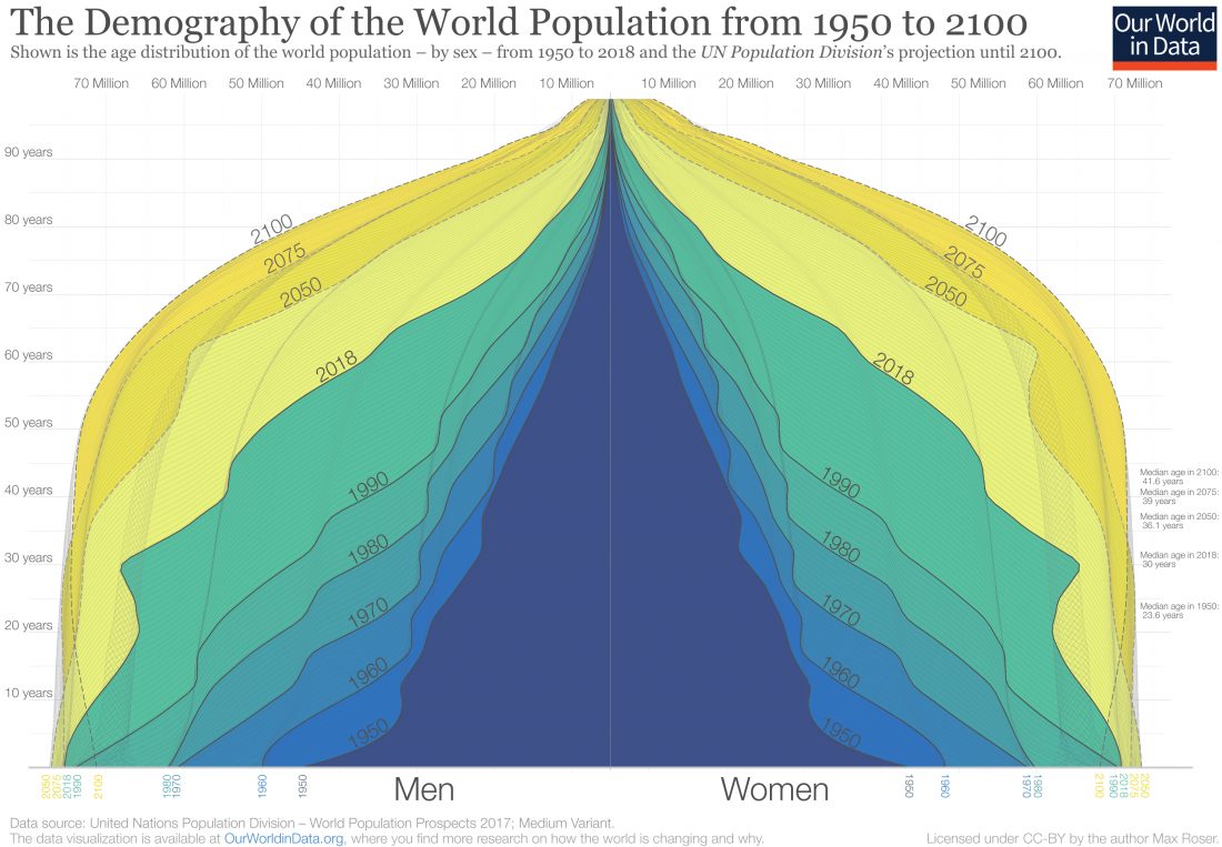 Figure 4 – Global population pyramid 1950–2100
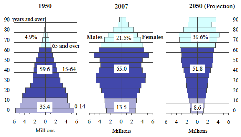
Figure 5 shows, in more detail, the situation in Japan, one of the developed countries whose fertility rate has been below replacement for the longest time. The Economist gives an account of how Japan is managing this demographic change. The changes in the population pyramid are quantified in terms of three main age brackets. We can see that the ratio of the oldest bracket to the youngest bracket above goes from roughly 14% in 1950 to a projected 460% by 2050.
Abe, Shigeyuki. (2009). Philippines’ competitiveness and global financial meltdown : a question of Japan’s role. Philippine Review of Economics. 46. 103-123.
Figure 5 – Changes of the global population pyramid of Japan 1950–2050
Figure 6 shows the changes that took place in the population pyramids of two large, medium-wealth countries (Brazil and China) and two large, rich countries (France and Japan) over two 35-year intervals. The graphs are set up so that blue represents males and red represents females. As we follow each country down its column, we see that the bottom-most bracket has shrunk in all of them from 1950–2020, albeit by different amounts.
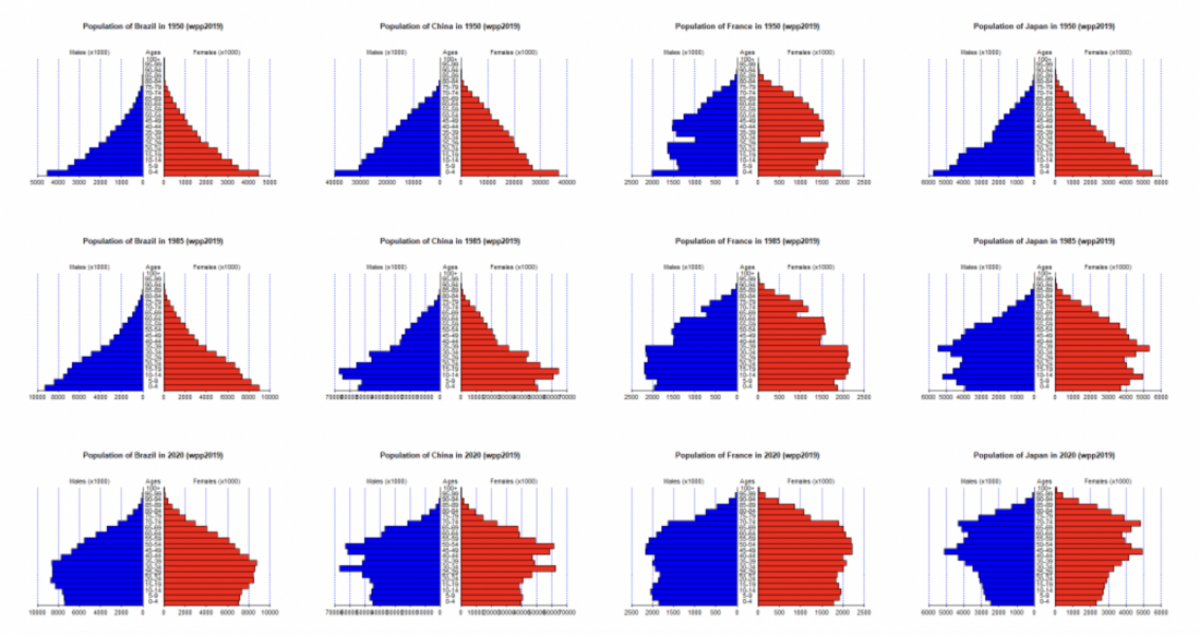 Figure 6 – Changes in the population pyramids of Brazil, China, France, and Japan in 1950, 1985, and 2020
Birth rates and fertility rates are not the only contributors to the demographics of countries. Death rates and immigration are also important contributors. The next blog will focus on these two indicators.