In the last few blogs (starting with the September 24 blog) I alternated between two topics – the continuing discussion of fresh water stress and my reactions to the beginning of the publication of the 5th IPCC report (AR5). Here, I will pause from those themes, and instead try to expand on the unique situation in which we currently find ourselves: trying to react to the continuous progression of events not as observers but as participants. One of the consequences of being a participant in a constantly changing environment is that the observations on which we base our discussion are out of date the moment that we have finished writing.
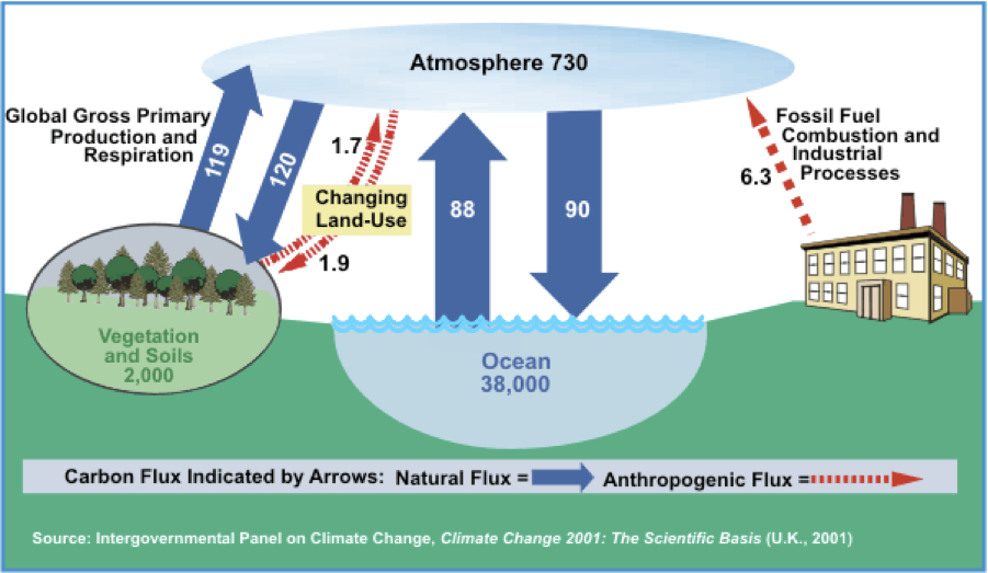
To demonstrate the issue of being instantaneously out of date I will use my June 25, 2012 blog regarding the Carbon Cycle as an example. The central feature in that blog was a description of the carbon cycle given below, as obtained from the IPCC’s 3rd Assessment Report (AR3). I compared the figure to an identical one that lacked the numbers, and made the claim that while the figure with the numbers constituted scientific reporting, while the one without, did not. Skeptical Science liked this blog and published it on their website as a guest blog. One of the comments that I received was that the data was not up-to-date. The commenter was right. In the 11 years that have passed since AR3 was released, some rather different numbers have emerged.
 Now that the first part of the new IPCC report has been published, I can compare the figure to its replacement in the new report, as shown below (the figure is referred to in the report as a “simplified schematic,” Figure 6.1, p122):
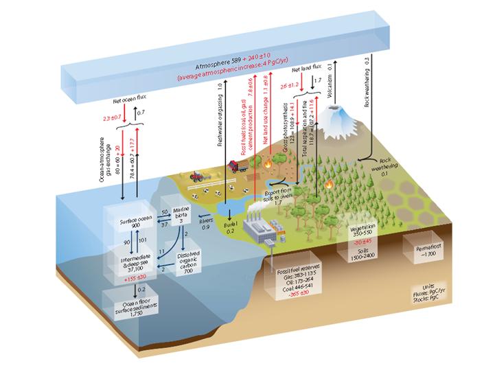
The new figure is much more crowded and complicated than the older figure was. It is not easily seen with normal viewing magnification but fortunately, it is accessible with amplified magnification. The units are the same in the two figures – billion metric tons of carbon. In both figures, the arrows represent carbon exchange fluxes in billion tons/year. The red lines (broken in the 2001 figure) represent anthropogenic (man made) contributions and fluxes. The red numbers in the 2013 figure represent cumulative reservoir masses since 1750 (the year which serves as the standard reference for pre-Industrial Revolution data).
Let us compare the atmospheric reservoirs in the two figures: The 2001 figure gives the amount of carbon as 730 Gt-C, while the 2013 figure cites it as 589 + 240 ± 10; the second number in this last set is indicative of the cumulative human contribution. The total number in the newest figure is 829 ± 10 Gt-C. If we then use the average rate of 4Gt-C/years to subtract the difference that accumulated during those 10 years, we can compare the 789 Gt-C in the new figure with the 730 Gt-C in the old – a difference of about 7%.
As an exercise, you are all more than welcome to compare the other entries in both figures.
The best demonstration of the changes that have taken place lies in the growth in global population. One of the best sites for visual understanding of this can be found here. It is astonishing to watch how quickly the numbers change. Every value of the data that we are studying depends on the population.The approximate value at the time that I write this blog is 7,186,000,000, which is startling when compared to the population of approximately 2,000,000,000 people when I was born.
The fast changing reality in which we we live is another demonstration of the light-cone description that I described in last week’s blog. Our presence is changing so fast that we don’t have time to write about the present – only about the past and the trends that we anticipate for the future. That of course, makes it that much more imperative that we work to understand and shape that future as best we can.