Last week, I promised to shift my focus to COVID-19’s impact on developing countries. So far, most of the media attention has been limited to the coronavirus’ impact on richer countries (e.g. US, Europe, Australia, Canada, etc.). The exact definition of “rich” or “developed” differs by source but generally makes up roughly 15% of the population, globally. This leaves 85% of the global population unaccounted for. Given that COVID-19 is a global pandemic, we cannot stop it unless and until we address the ability of developing countries to fight it.
I have decided, however, to momentarily shelve that topic. Many of those wealthy countries are shifting their discussions from fighting the virus’ spread (flattening the curve) to mitigating its disastrous effects on the economy.
Countries have adopted social distancing policies, urging or demanding that their citizens stay home, since the virus emerged. China started these measures at the end of January; the US and Europe followed at the beginning of March (my school in NYC closed on March 11th). In the beginning of April, Dr. Deborah Birx, the White House coronavirus response coordinator, revealed the virus’ frightening impact in the US. She showed a model predicting the future development of the pandemic in the US, assuming continued social distancing.
Predicting the Future
I discussed her presentation in a previous blog (April 7th, 2020) but I didn’t go to any details about the model on which the predictions were based. At that time, we were looking at a possible 100,000-240,000 deaths just in the US. The curve shows the number of deaths per day vs. the expected number of days of the pandemic.
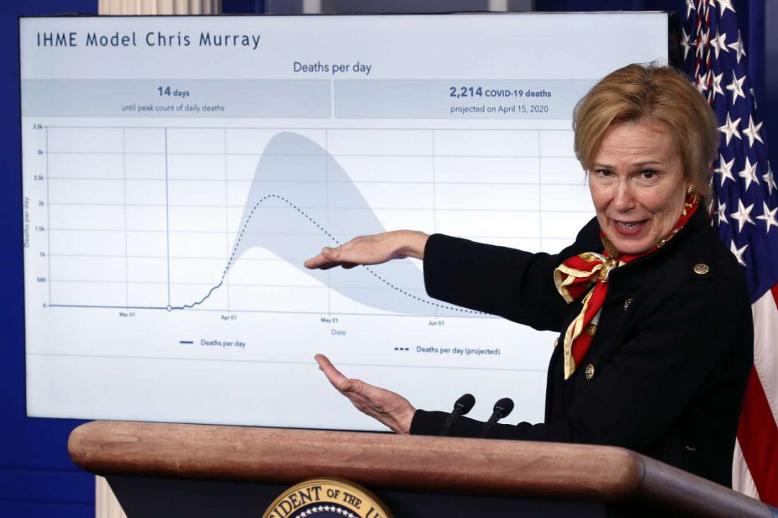
Figure 1 – Dr. Deborah Birx on March 31st
The curve in her chart comes from a model developed by Dr. Chris Murray from the University of Washington. His methodology incorporates almost everything we know about the pandemic. It is updated on an almost daily basis, using public sources.
IHME
The latest report from the Institute for Health Metrics and Evaluation (IMHE) came out on April 21st and included the data shown in Figure 2. It shows the number of deaths in the US starting to stabilize by the end of April, around 60,000.
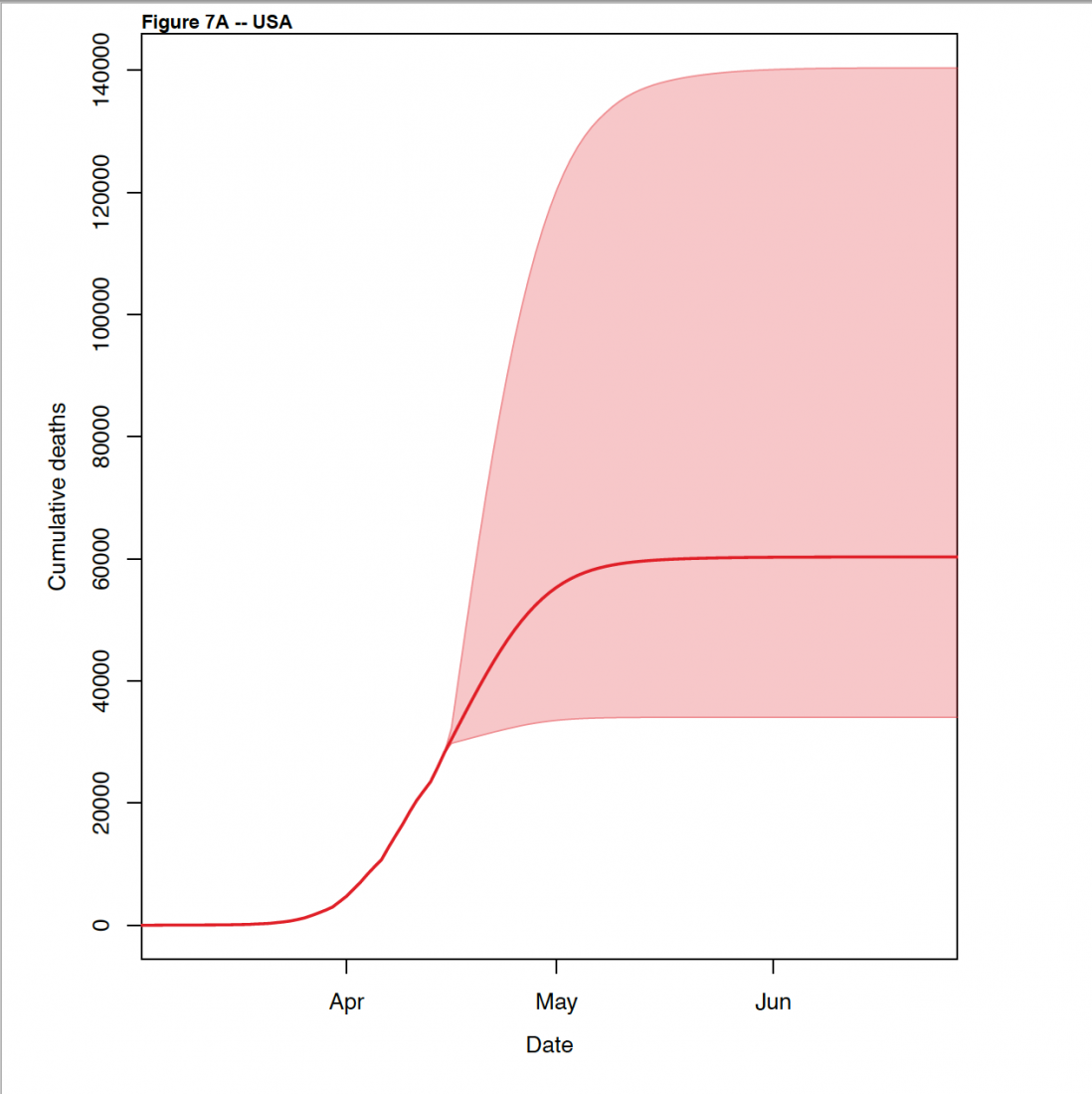 Figure 2 – Total number of deaths in the US, the predicted increases, and the estimates of the uncertainty in these predictions in the recent version of the IHME report.
Summary
Background: Hospitals need to plan for the surge in demand in each state or region in the United States and the European Economic Area (EEA) due to the COVID-19 pandemic. Planners need forecasts of the most likely trajectory in the coming weeks and will want to plan for the higher values in the range of those forecasts. To date, forecasts of what is most likely to occur in the weeks ahead are not available for states in the USA or for all countries in the EEA.
Methods: This study used data on confirmed COVID-19 deaths by day from local and national government websites and WHO. Data on hospital capacity and utilization and observed COVID 19 utilization data from select locations were obtained from publicly available sources and direct contributions of data from select local governments. We develop a mixed effects non-linear regression framework to estimate the trajectory of the cumulative and daily death rate as a function of the implementation of social distancing measures, supported by additional evidence from mobile phone data. An extended mixture model was used in data rich settings to capture asymmetric daily death patterns. Health service needs were forecast using a micro-simulation model that estimates hospital admissions, ICU admissions, length of stay, and ventilator need using available data on clinical practices in COVID-19 patients. We assume that those jurisdictions that have not implemented school closures, non-essential business closures, and stay at home orders will do so within twenty-one days.
Findings: Compared to licensed capacity and average annual occupancy rates, excess demand in the USA from COVID-19 at the estimated peak of the epidemic (the end of the second week of April) is predicted to be 9,079 (95% UI 253–61,937) total beds and 9,356 (3,526–29,714) ICU beds. At the peak of the epidemic, ventilator use is predicted to be 16,545 (8,083–41,991). The corresponding numbers for EEA countries are 120,080 (119,183–121,107), 32,291 (32,157– 32,425) and 28,973 (28,868–29,085) at a peak of April 6. The date of peak daily deaths varies from March 30 through May 12 by state in the USA and March 27 through May 4 by country in 31 the EEA. We estimate that through the end of July, there will be 60,308 (34,063–140,381) deaths from COVID-19 in the USA and 143,088 (101,131–253,163) deaths in the EEA. Deaths from COVID-19 are estimated to drop below 0.3 per million between May 4 and June 29 by state in the USA and between May 4 and July 13 by country in the EEA. Timing of the peak need for hospital resource requirements varies considerably across states in the USA and across regions of Europe.
The IHME models and most other similar models worldwide are not designed as tools for policy makers and/or societies to decide when to start to relax lockdowns. They are meant to predict the capacity that health care systems will need to take care of the infected people. As everybody has seen, especially in hot spots such as New York City, when the flow of serious symptomatic infections exceeds the capacity of the healthcare system to handle these patients, many people die unnecessarily. Sending more people to already overcrowded healthcare facilities in the middle of pandemics is not the way to go. We have to be prepared.
The PDF format of the full report is a must-read. It lays out the methodology in great detail (some high math is involved) and points to the up-to-date global information on which the models are based. As in most predictive models, it includes three elements: past, future, and uncertainty (we can see them clearly in Figures 1 and 2). In Figure 1, the curve starts at the beginning of the impact in the US (18 deaths/day); in Figure 2 the starting point is basically the same. Close to three weeks later (April 20th), the total number of confirmed dead from COVID-19 in the US reached 40,000. From that point we start the prediction stage, including the range of uncertainty associated with these predictions.
Testing Antibodies
In the case of COVID-19, the main source of uncertainty is the global inability to measure the virus’ level of penetration. We have made some progress in this area, albeit small. The governor of New York State, Andrew Cuomo, just announced the results of a blood test of 3,000 randomly chosen NYC residents for new coronavirus antibodies. When a person is infected, his/her immune system creates specific antibodies that can fight the infection. Detection of these antibodies is one of the best indicators that a given person was infected with the virus.
The tests indicated 14% of the cases were positive. If we try (as the Governor did very cautiously) to expand this result to the entire population of New York State (about 20 million) and assume that the 3,000 people tested in NYC is a representative sample of the state population, the testing suggests that 14% of 20 million = 2.8 million people were infected. As of four days ago, the state officially reported about 260,000 positive cases, with mortalities close to 16,000 to date. Comparing these results would indicate that only 1 in 10 infected New Yorkers is being confirmed through testing. It would also indicate that the mortality rate of this pandemic in NYS is 0.5%, way below the 3.4% reported earlier by the WHO.
However, by universal admission (including that of Governor Cuomo) the sample of 3,000 from NYC is not representative of the rest of the state. Many of the infections throughout the world, including in NYC, are taking place in hot spots such as nursing homes, low-income neighborhoods, highly concentrated observant religious communities, etc. It will take many more tests to obtain reliable information—thus the uncertainty in the models.
Antibody test in various forms have already been taking place on an experimental basis throughout the world. But the tests are not reliably accurate. The results range from around 5% to 14% positive. There is agreement that such tests have the potential to give a wider view of the degree of infection than direct testing—especially because most of the latter goes to symptomatic cases.
After a Peak (If There Is One)
Nor do we know how exactly the pandemic will decline. It could be a single smooth event as shown directly in Figure 1 and indirectly in Figure 2 (Figure 2 shows cumulative deaths and daily deaths). Or it could—and most likely will—include several waves of infection before it plays out. The only valid “recent” precedent is the Spanish Flu of 1918-1919, which had an estimated fatality of one third of the global population. That pandemic ended after three waves, the middle one being the deadliest.
Let me now move to climate change. The issues are connected because, similarly to the present pandemic, we need to prepare in order to minimize the immense impacts. Preparation needs modeling of the future. We’ve discussed such modeling of climate change in previous blogs (type carbon intensity in the search box). Figure 3, for example, comes from my July 10, 2018 blog.

Figure 3 – Projected carbon intensity of global temperature increase caused by climate change
The emission of carbon dioxide is a measurable quantity. The impact of the increase in global temperature is shown on the vertical axis. The area between the top line and the bottom line in the figure is an estimate of the uncertainty (as in Figures 1 and 2). In this case, the uncertainty is not caused by the lack of measurements but rather by unpredictable contributions from feedbacks (see again the July 10, 2018 blog). For instance, the enhanced evaporation of water vapor serves as an effective greenhouse gas. One of the important differences between Figure 1 and Figure 3 is that Figure 1 has a maximum, after which the impact decreases until it disappears (not counting possible waves). Figure 3 doesn’t have one, at least within a human timescale. Climate change is an even larger existential threat than COVID-19. We can’t go backward in time to prevent the coronavirus but it’s not too early to minimize anthropogenic climate impacts through changes in the way we live.
For more than a year, the whole planet is suffering from the corona pandemic. It caused a lot of panic, fear, and anxiety.
People started to worry more about themselves, their families, and their beloved ones, which led them to take some more protective actions.
A lot of our daily routine has changed; staying home is all we can do now. And if we have to go out a lot of precautions must be taken.
We had really missed being in contact, hugging each other, shaking hands, and live freely. we hope to be safe soon