Globally, we should be able to learn how to handle our collective humanity from other planetary species that survive longer than ours and surpass us in technological progress. But where are they?? Almost from the beginning of writing this blog, I tried to describe humanity’s efforts to find another planet with existing life (See December 17, 2013 – “Hanukkah, Thanksgiving, and the Drake Equation”). We are still looking. The two coolest stars, with surface temperatures just below 2000oK are shown in Table 1 (with data from Wikipedia):
Table 1 – Stars with the lowest surface temperature (from Wikipedia)
| Name of star | Surface Temperature in Kelvin degrees | Distance in Light years |
| CWISE J1249+3621 | 1715 – 2320 | 408 |
| 2MASS J0523-1403 | 1939 | 41.6 |
To convert Kelvin to Celsius, just subtract 273. To convert the Celsius to Fahrenheit, multiply the Celsius by 1.8 and add 32. Living organisms cannot survive under these conditions. The required low surface temperature makes detecting planets outside our solar system (exoplanets) much more difficult. The total number of exoplanets that were detected is 5,500 (AI summary). The 2013 blog describes the Drake Equation, which serves as a key for estimating the number of exoplanets that could carry life.
An alternative is to estimate when other advanced technology could come to us, telling us what to do to survive. The Fermi Paradox tries to address the feasibility of this happening, based on previous experience. I summarized the Fermi Paradox in terms of our planet’s existential threats, in the following way (“Climate Change, The Fork at the End of Now,” Momentum Press, 2011):
The beginning of our technological intelligence can be traced to the middle of the previous century (computers, rockets, lasers, etc.). The time scale that the scientists at SETI are talking about is about a million years. Even if we are a bit more modest and choose a time scale of only 1000 years to develop technology to reach habitable planets in case Earth becomes inhospitable, we cannot control most cosmological events that might lead to the destruction of life on Earth. We can, however, control some of our local collective behavior and monitor the planet to ensure survival.
SETI, in this quote, stands for “Search for Extraterrestrial Intelligence.” The conclusion is that we would do much better to try to prevent destruction of our planet rather than wait for an external answer. Therefore, we must learn how to be safe, but the learning has to proceed internally—from each other—based on trial and error, coupled with scientific analysis of the destruction threat.
The present US administration is trying to decouple the decrease in carbon emissions from the slowed growth of GDP. I wrote a blog on this topic (January 14, 2026):
The main argument the Trump administration raises is that any action away from fossil fuels and towards sustainable fuels will damage the economy, thus hurting the people who voted for him in the presidential election. Meanwhile, there has been plenty of progress in the global energy transition. These dynamics can be summarized as Trump trying to swim against the current of progress. Last week’s blog described the present US administration’s “swimming” in a manner similar to most press coverage throughout 2025. This blog will start discussing the “current” instead; this, too, is a more recent media trend…
More recently, a judge “temporarily” negated this approach:
A federal judge on Tuesday blocked the Trump administration from enforcing a series of decisions that wind and solar developers say have throttled hundreds of renewable energy projects across the country.
Judge Denise J. Casper of the U.S. District Court for the District of Massachusetts granted a preliminary injunction in a lawsuit that a coalition of renewable energy developers filed against the Interior Department in December. The developers argued that the Trump administration was unlawfully discriminating against wind and solar power, impeding projects on public and private land.
In her ruling, Judge Casper, an Obama appointee, said the developers were likely to prevail on the merits and ordered the Interior Department to stop implementing a series of memos, issued last year, that subjected renewable power to intensified reviews and new restrictions.
A book that is based on the same premise of attempts to prevent existential destruction, is called Earth for All. A summarizing paragraph from that publication is given below:
Earth for All: A Survival Guide for Humanity Published in 2022, this book details the findings of our initiative and details how we can steer humanity away from ecological and social catastrophe. The book is the result of collaboration between the 21st century Transformational Economics Commission and systems analysts and modelling teams. The lead authors are Sandrine Dixson-Declève, Owen Gaffney, Jayati Ghosh, Jørgen Randers, Johan Rockström and Per Espen Stoknes. Published in 2022, this book details the findings of our initiative and details how we can steer humanity away from ecological and social catastrophe.
A previous blog (February 11, 2026), was titled, “Change in Leadership: Developing Countries – Decoupling,” with decoupling referring to energy consumption, specifically by developed countries. Two months later, the situation is changing drastically:
In economics textbooks, higher energy prices from the war in the Middle East display the power of the markets to efficiently decide who gets what. Yet in the real world, a cruder sort of power appears at work.
The conflict has severely constricted the supply of oil from the Persian Gulf. Countries with the financial means — China, Japan, Europe, the United States — are securing much of what they need, paying whatever it takes. Some are restricting exports to hold on to what they have.
That has pushed prices higher everywhere. At the same time, shortages threaten less affluent nations in Asia, sub-Saharan Africa and Latin America.
Some economists are describing this as hoarding.
“The market is not some harmonious allocating mechanism, but ends up being the law of the jungle,” said Isabella Weber, an economist at the University of Massachusetts, Amherst. “Rationing by price explosion ends up being fundamentally unjust.”
An alternative approach is to rely on the mechanism of economic growth that all of us subscribe to. This mechanism was formalized by the Kuznets curve and described by a graduate student of mine in a previous blog (January 9, 2023) in the context of the Indian subcontinent. Figure 1, taken from the Wikipedia entry, describes the Kuznets curve in terms of environmental degradation.
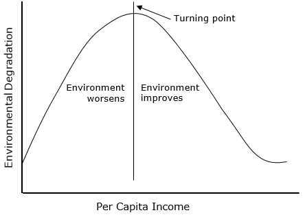
By GovinddelhiThis diagram was created with Microsoft Word. – The diagram is made using Microsoft Word., CC BY 3.0, https://commons.wikimedia.org/w/index.php?curid=85241915
Figure 1 – Environmental Kuznets curve
Table 1 shows compiled data for carbon intensity, estimated alignments within the environmental Kuznets curve, population, and GDP/Capita in the 10 most populated countries, which together are responsible for more than half the global population. With one exception (Ethiopia), these countries are the same as those on a list showed in a recent blog (February 11, 2026) in another context—a fun coincidence
The peak in the Kuznets curve was estimated at $25,000 – $50,000 GDP/Capita
Carbon Intensity – is in $2021 PPP GDP
Source for Carbon Intensity – Global Economy/EDGAR 2025
Right Side of the Kuznets peak: These economies have passed the “turning point.” They continue to grow their GDP, while their carbon intensity and absolute emissions generally decline. The only country from this list that clearly qualify is the US. The volatility of Russia makes her to fluctuate around the peak.
Near the Kuznets Peak: Include China and Brazil, the Upper Middle-Income countries. These countries are near the apex of the curve. They are the world’s manufacturing hubs where carbon intensity is highest but starting to plateau or slightly dip.
The Left Side of the Kuznets Curve: These economies are still in the early-to-mid stages of industrialization. As their GDP grows, their infrastructure and energy needs often result in rising (or high and stable) carbon intensity. All these countries are either developing or Lower Middle-Income.
Recent 2026 economic analyses warn of an “N-shaped” curve, where extremely high-income levels might lead to a second rise in environmental impact due to hyper-consumption. Currently, none of the 10 most populous countries have reached this “rebound” stage.
Coincidentally, the data for population and GDP/capita are almost the same as the one used in a recent blog (February 11, 2026) (with exception of Ethiopia).
Table 1 – Compiled data for carbon intensity, estimated alignments within the environmental Kuznets curve, population, and GDP/capita
| Country | Carbon intensity in kg/$ (≈2024) | Estimated location on the Kuznets curve | Population in millions (2024) | Latest GDP/capita in US$ (in thousands) |
| China | 0.39 | Near the peak | 1,425 | 12.7 |
| Russia | 0.33 | Right but volatile | 144 | 13 |
| Indonesia | 0.2 | Left | 277 | 4.8 |
| India | 0.22 | Left | 1,428 | 2.4 |
| USA | 0.18 | Right of peak | 339 | 76.3 |
| Pakistan | 0.15 | Left | 240 | 1.6 |
| Brazil | 0.12 | Near the peak | 216 | 9.0 |
| Nigeria | 0.1 | Left | 224 | 2.2 |
| Bangladesh | 0.09 | Left | 173 | 2.7 |
| Ethiopia | <0.05 | Left | 128 | 0.9 |
Figure 2 shows the annual solar + wind generation per person of most of the developed countries that continue to march through the transition despite the recent US administration’s path against the stream.
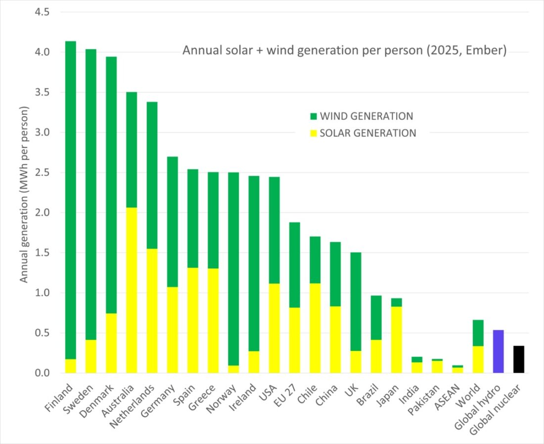
Figure 2 – Annual solar and wind generation per person (Source: pv magazine)
Table 1 provides the impression that within a factor of two, the carbon energy intensity of rich and poor countries is approximately the same. My next blog will try to explore this observation.
 Me
Me  Figure 1 – India data center market forecast (Source:
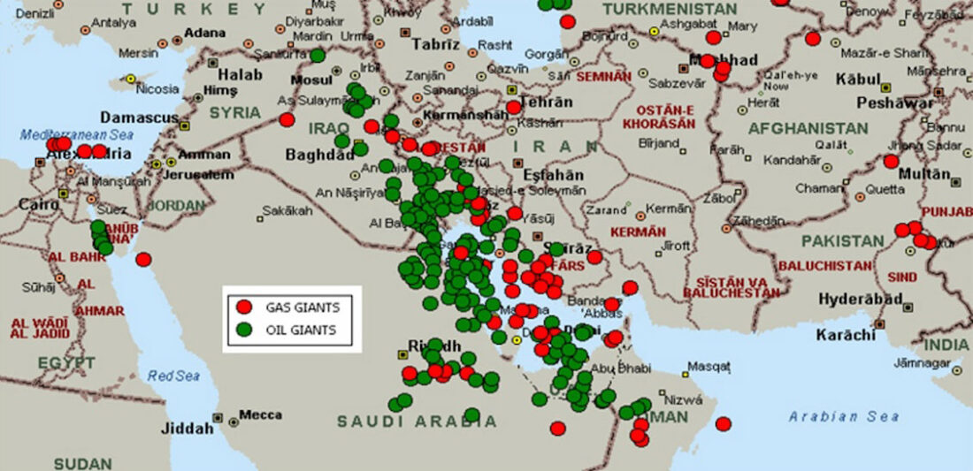 Figure 1 – Map of oil and gas reserves in the Middle East (Source:
 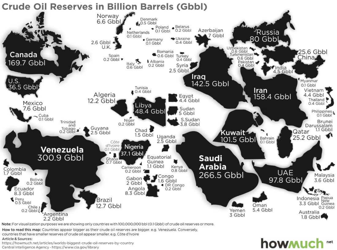 Figure 2 – Global distribution of oil reserves (Source:
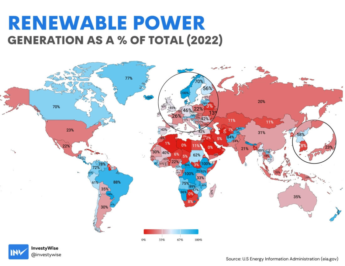 Figure 4 – Renewable energy as a percentage of energy use by country (Source:
 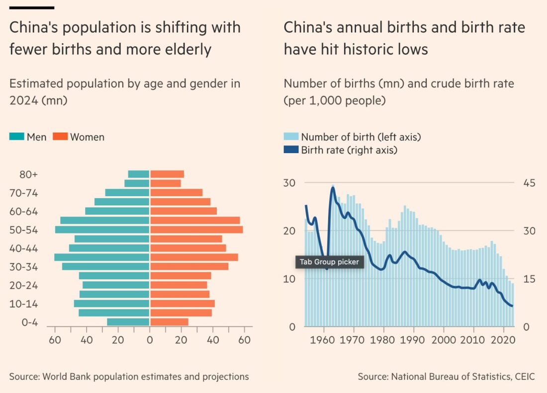 Figure 1 – China’s changes in fertility and a recent population pyramid (Source:
  Figure 1 – Drawing of the Boston Tea Party (Source:
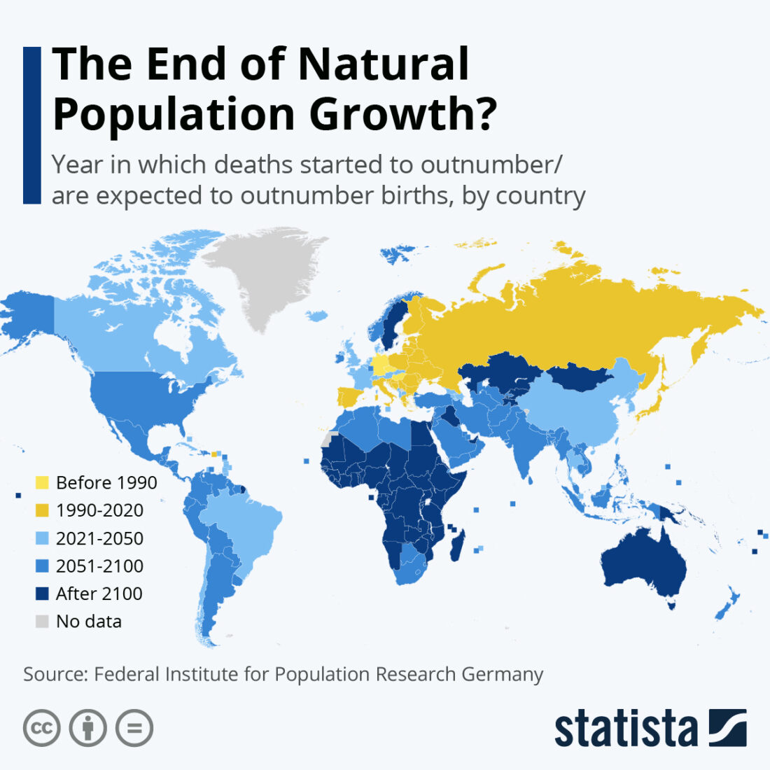 Figure 1
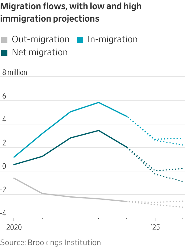
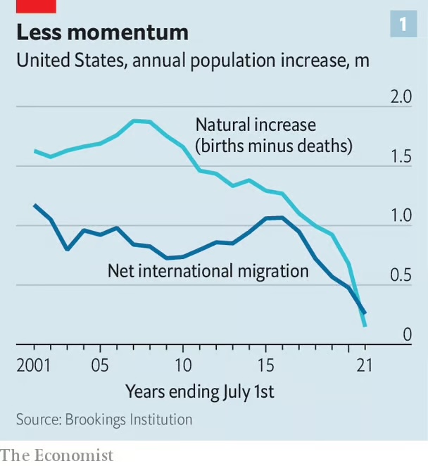 Figure 2 – Population increase in the US