Toward the end of last year (December 9, 2014), I started a series of blogs taking stock of where we stand, in light of this year’s anticipated Paris meeting (December 2015) that will try (again) to formulate an international agreement to mitigate climate change:
I will try to welcome 2015 a bit differently. On November 11th, the US and Chinese presidents came to a landmark agreement: the US will accelerate the speed of its current reduction of greenhouse gas emissions so that its level by 2025 will be close to 30% below its level in 2005 (double the pace of reduction it targeted for the period from 2005 to 2020). Meanwhile, China’s emissions will peak by 2030 – by which time sustainable sources should constitute at least 20% of its energy supply. People around the world saw this agreement by the two worst polluting countries as a good framework upon which to base a global agreement – one which will be discussed at the United Nations Climate Change Conference scheduled be held in Paris, France in December of 2015. Many eyes are now turning to India to see if it will follow. I will try to follow the global preparations for the December 2015 Paris meeting and include updates in this blog.
I promised in that blog that I would describe the energy transition processes in a few key countries. I started then with Germany (December 9, 2014), and will continue now with India. A recent (2014) ranking of carbon emissions by country puts India in third place with 5.7% (following China – 23.4% and US with 14.7%).
In terms of energy usage per person, however, the picture is different. Figure 1 shows the comparison with other key countries.
 Figure 1
Figure 2 shows a more detailed comparison of the relevant parameters with China. It is clear from both figures that on a per person basis, India is far below all the rich countries and even many developing countries, most importantly China. By almost every measure, India is a very poor country that strives to catch up with the more affluent parts of the world.
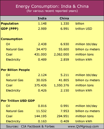 Figure 2 – Comparison of the relevant parameters for energy consumption between India and China.
For a number of years, I have used India as my ideal, seeing it as a beacon; a lighthouse for the world in these matters. The country epitomizes many of the imperative changes necessary for a future with a much more equal world; one many of us want to see. Unfortunately, idealism aside, the world needs safeguarding against existential hazards such as anthropogenic climate change, and using India as a model for the scale of action might make mitigation seem like an insurmountable pursuit.
The figure below (marked as figure 9.4) shows why. The figure was taken from my book (Climate Change: The Fork at the End of Now- Momentum Press (2011)). Below the figure, I have included an excerpt from the book as an explanation. The figure serves as a focal point for an assignment in my courses on climate change. The courses are open to all of the school’s students, provided that they have passed the regular core requirements, including introductory offerings in both the physical and social sciences (what we call Upper Tier Core).
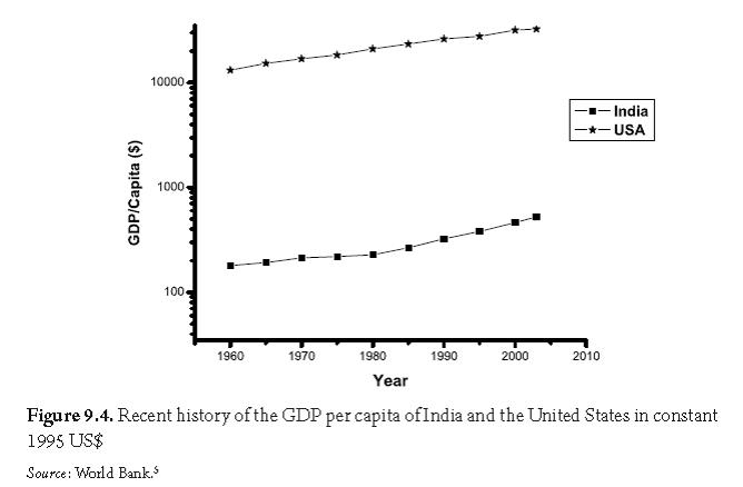
The figure shows the changes in the GDP per capita since 1960 for India and the United States. India was chosen as an example because it is the most populous country in the low- income group while the United States was chosen because it is the most populous country in the high- income group. You will notice something peculiar in the graph not yet mentioned in this book. The scale of the vertical axis is not linear: 100– 1000 is the same distance on the vertical axis as 1000– 10,000, which on a linear scale would take 10 times the space. Such a scale is called a logarithmic scale. It is used here because the Indian GDP per capita is more than a factor of 10 smaller than the US GDP per capita. If we showed both countries on the same linear graph, then the scale of the graph would have to be adjusted to that of the United States, and India will be extremely close to the horizontal axis. Plotting them on a logarithmic scale makes both economies visible and relatively easy to compare.
I will push this a bit further. Inspecting the two lines on this scale, we notice that the US line is approximately a straight line, while the India line changes to an increased slope around 1980. Straight lines on this scale means exponential growth with a constant growth rate (remember Chapter 2). One can calculate this rate from the graph. In this case I will skip the details. The rate for the United States is 1.5%. This rate is expressed in constant US dollars, which means that the inflation rate in the United States is discounted. We can do the same for India— the Indian economy grew until 1980 at an approximate rate of 0.9% in real US dollars, followed by an accelerated rate of approximately 2.5%. These calculations are performed with units that already discount population growth (because we calculate GDP per capita) and inflation in the United States. It is an old axiom of geometry that two unparallel, straight lines must meet somewhere. From the graph, we can calculate where the lines will meet. If the US economy continues to grow at the same rate that it grew since 1960, and the Indian economy continues to grow at the same rate that it grew since 1980, then the two economies will have the same GDP per capita in about 300 years. This time is way beyond “now,” but it is a trend that needs to be seriously considered. Presently the average American is richer than the average Indian by a factor of about 60. When the two extrapolated economies will converge in terms of an average individual standard of living 300 years from now, the GDP per capita of the two economies will reach the astronomical number of 3.5 million US$ (this is already after discounting inflation and population growth). Such is the power of an extrapolated exponential growth without imposed limits.
The students are asked to use the graphs to calculate the time it will take for an average Indian to have the same average income (in the form of GDP/capita) as an average American, assuming a business as usual scenario (i.e. extrapolating the future from the present). From this data, they continue to calculate energy use and climate change parameters of that world, again, based on a business as usual scenario.
More than two years ago (December 3, 2012), in a different context, I discussed a similar exercise where students had to predict a scenario of when the GDP of an average Chinese citizen might match that of an average American. At the time, I invited everybody to try their hand with their own scenario. I repeat the request here.
Next week I will start to focus on what India is doing right now.
It show that Chain will take 6 years to catch up with the USA according to whose grow faster. The growth is taking into account many Effects of economic and population, or having a war or natural disasters in both country. However, I read an article about ” India growth will beat china this year” and that is due to the changes in accounting and not necessarily a boom in India earnings. So, the GDP/Capita growth is unstable shifting between countries over years.
That is something to think about – business as usual extrapolation of intensive parameters can bring interesting results.
I think it would take India 160 years to catch up to the United States in terms of GDP/Capita. At that point the average GDP/Capita for both would be just over $800,000.