As promised, this blog and the next (barring unforeseen circumstances) will focus on some key indicators of the global energy transition – specifically with regard to climate change and the IPAT identity. I am continuing my study of the same 12 most populous countries, which together represent more than half of the world’s population as well as the full spectrum of economic development. Almost all of the indicators will be presented on a per person basis that will enable us to compare countries with different populations.
As before, the population data are based on the UN accounting and the GDP data comes from the World Bank. I have sourced the primary energy and carbon data from BP’s annual statistical review of global energy, which I consider one of the most reliable and politically neutral sources for this kind of data.
Unfortunately BP does not include specific data for Nigeria, Ethiopia or the Democratic Republic of Congo. In its section on Africa, BP only lists Algeria, Egypt, South Africa, and “the rest of Africa.” This is likely because of the individual countries’ low GDPs/Capita and their comparatively low carbon emissions and energy use. That said, the omission of Nigeria in a database focused on energy baffles me. For the moment I won’t try to fill this gap with information from a different database. In the future I may revisit this decision.
My perspective of human equality informs my choice to present data in its intensive form (per person). The only extensive presentation (not dividing by population) that I am including is the share of global carbon emissions. This is important because regardless of the degree to which we contribute to it, we all share the impacts of carbon emissions.
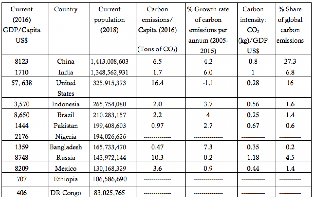
Table 1 – Indicators directly related to carbon emissions of the 12 most populous countries
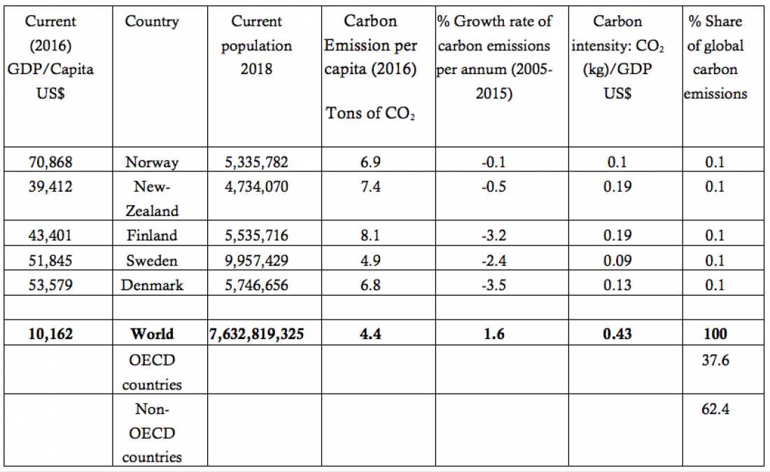
Table 2 – Same indicators for five small, developed countries that are ahead in their energy transition and three different global entities.
Close observation of Table 1 reveals that the carbon intensity of the countries is approximately constant, regardless of the country’s size or wealth. Taking the average and the standard deviations of these values we arrive at:
Average carbon intensity = 0.6 ± 0.53
Table 2 shows direct measurement of the global carbon intensity; it is 0.43 – well within the range of the carbon intensities of the countries in Table 1.
The carbon intensities of the five small, developed countries shown in Table 2 are on the low end of the range of those shown in Table 1. They can be labeled “black swans” (low probability) in the distribution and are among the strongest driving forces that account for the countries’ low emissions. Russia stands out as the black swan on the other end of this spectrum.
Table 1’s column dedicated to each country’s global share of carbon emissions shows us that together, the US and China account for about half of all global emissions. This underlines how much they need our special attention in pushing for effective mitigation policies.
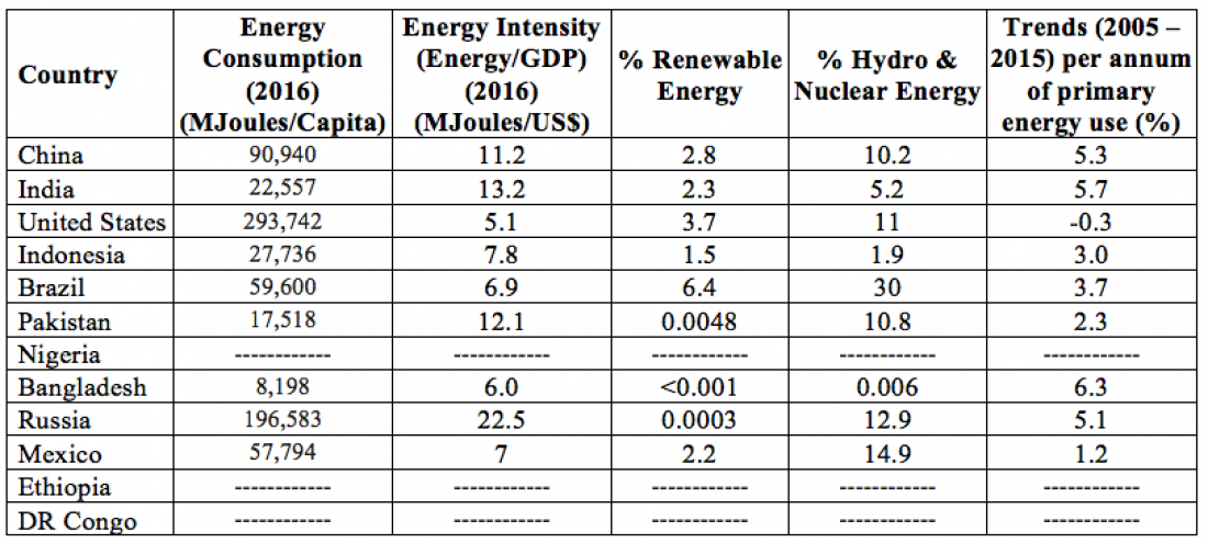
Table 3 – Indicators related directly to primary energy use of the same countries as in Table 1
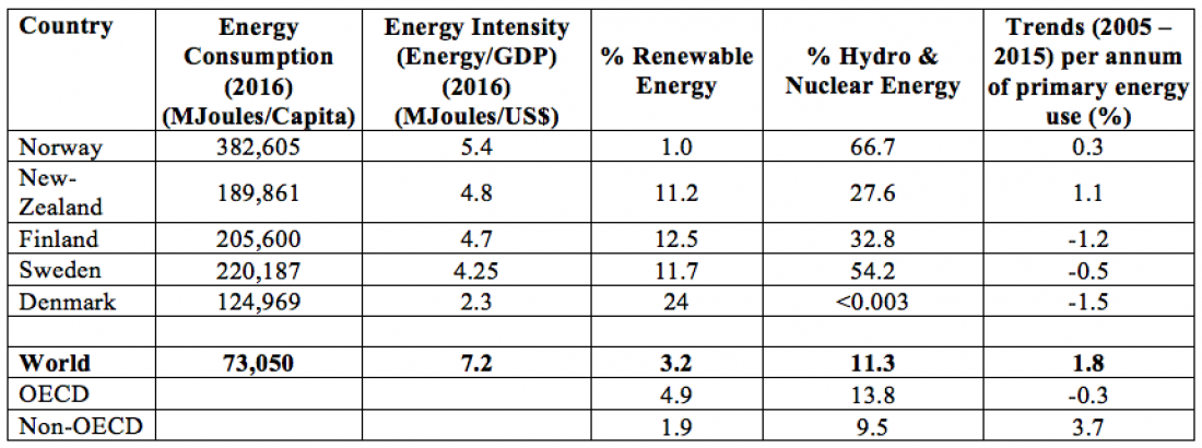
Table 4 – Indicators from Table 3 for countries and regions listed in Table 2

Tables 3 and 4 show that the energy intensity reflects a similar pattern to the carbon emissions– but with an even narrower spread:
Average energy intensity = 10.2 ± 3.5
The similarities in the behaviors of the energy intensity and carbon intensity include all the same aspects of uniformity of behavior. These similarities include the agreement with the global direct measurements, as shown in Table 4, and the black swans on either side of the distribution (Norway, New Zealand, Finland, Sweden, Denmark, and Russia).
There is an argument that once a country passes through some development threshold, further development is less energy intensive. Thus, it posits, the same energy distribution will show smaller energy intensity (Energy/GDP), resulting in smaller carbon intensity (CO2/GDP) because most anthropogenic carbon comes from sourcing energy from fossil fuels. I will address this issue later.
It is certainly true that at less than 15%, the United States doesn’t stand out in its use of alternative (non-fossil fuel) energy sources. However, the five small countries that I selected as examples of this transition show much larger shifts. Among these countries, only Sweden uses nuclear energy as one of its alternative sources.
