Last week’s blog summarized the data for the global transition to a declining population, driven mainly by a major decline in global fertility rates. As I mentioned in that blog, the trend is not new and was discussed in earlier blogs that you can find through the search box. For many years, this decline was limited to rich, high-income countries. Data in last week’s blog show that the population decline is no longer limited to high-income countries but is now spreading through middle-income countries (see updated classification on the World Bank website), with India, the most populated low-income country, reaching the benchmark fertility of 2.1. Table 1 of last week’s blog summarizes the relevant data for 20 key countries in which the total population reaches more than 50% of the global population, all showing declining fertility rates lower than or equal to 2.1.
To get into more specific driving forces of this transition we can narrow the selection of countries to three: India, China, and the US. Together, the total population of these countries (greater than 3.1 billion) exceeds one-third of the global population. Additionally, each country represents the most populated country of one key income level: India – low income; China – middle income and US – high income.
Before we get into details, it will help to explore the general understanding of the global fertility decline through an NIH publication (US National Institute of Health). I will cite below the introductory paragraph:
There is a concern about declining birth rates in both the developing and developed world (www.rand.org). Fertility rates tend to be higher in poorly resourced countries but due to high maternal and perinatal mortality, there is a reduction in birth rates. In developing countries children are needed as a labour force and to provide care for their parents in old age. In these countries, fertility rates are higher due to the lack of access to contraceptives and generally lower levels of female education. The social structure, religious beliefs, economic prosperity and urbanisation within each country are likely to affect birth rates as well as abortion rates, Developed countries tend to have a lower fertility rate due to lifestyle choices associated with economic affluence where mortality rates are low, birth control is easily accessible and children often can become an economic drain caused by housing, education cost and other cost involved in bringing up children. Higher education and professional careers often mean that women have children late in life. This can result in a demographic economic paradox.
In this blog, I will focus on two issues that are mentioned above: women’s education and the extra options and opportunities it provides, and parental decisions based on a couple’s well-being as they age and need additional support.
Women’s Education
The following article is a follow-up to the 1995 Beijing Declaration and Platform for Action, which formalized the international community’s commitment to advancing education equality for women around the world. The paragraph below cites the introductory summary:
ACCESS TO PRIMARY EDUCATION Spurred by international commitments made in the context of the Education for All movement as well as the Millennium Development Goals, the vast majority of countries have made significant progress in terms of making primary education financially accessible: 89% of low-income countries, 97% of middle-income countries, and 100% of high-income countries have made primary education tuition-free. There are only seven countries in the world that report charging tuition fees for primary education: Comoros, Guinea, Papua New Guinea, Somalia, South Africa, Zambia, and Zimbabwe (see Map 1). Similarly, most countries have adopted policies to keep children in school at the primary level: there are only 15 countries that have not made primary education compulsory (see Map 4)(15).
Figure 1, taken from the same publication, shows the global spread of compulsory primary education, as of 2014.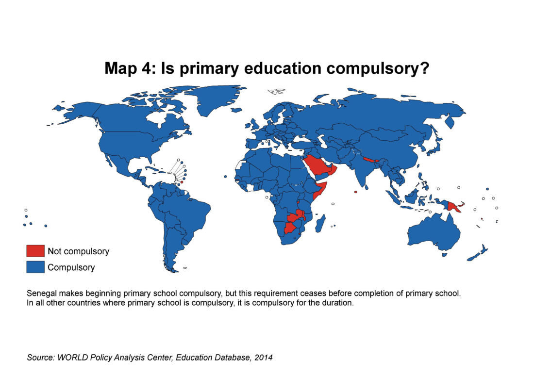 Figure 1 – Global map of compulsory primary education, 2014 (Source: WORLD Policy Analysis Center)
Compulsory primary education is considered to be a higher standard and more specific measurement in terms of content and timing than literacy, which, at its lowest level, is defined as the ability to read and write. Figures 2 and 3 show the recent changes in literacy in India and China.
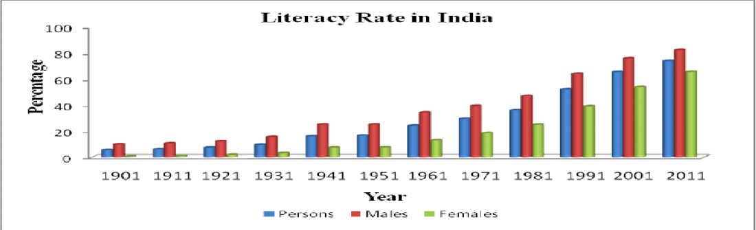 Figure 2 – Literacy rate in India, 1901-2011 (Source: Semantic Scholar)

Figure 3 – Literacy rate in China, 1982-2020 (Source: Statista)
The literacy rate in China is now approaching 100% for both genders, a figure identical to that of high-income countries.
Generational Support Through Health Care
The second driving force that I will examine below is the generational support necessary for health care as we grow older; there is an increased demand for and an uncertain supply of caregivers. The best indicator of this driving force is the changes that take place in life expectancy as determined at birth. Figures 4 and 5 show the changes in two different regions. Figure 4 shows the changes that have taken place over my lifetime in India, the most populated country in the world. It is a low-income country whose fertility rate is sharply declining and has reached a replacement level of 2.1 on its way down. The life expectancy trajectory is almost a reflection of the decrease in fertility rate.
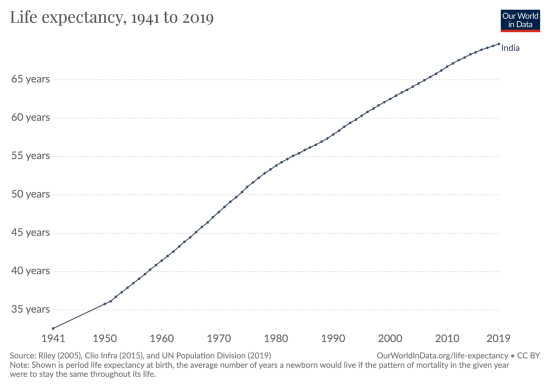 Figure 4 – Life expectancy at birth in India, 1941-2019 (Source: X @OurWorldInData)
Figure 5 shows the changes that are now taking place in this indicator in Africa. The Visual Capitalist infographic at the top of last week’s blog lists the 10 countries with the highest fertility rates (well above replacement level). Some of the later high fertility rates are a result of the devastating impact that the AIDS/HIV epidemic inflicted on many countries in Africa toward the end of the last century; among other factors, many have opted for more children to replace those who have died. The impact of this epidemic shows up on the life expectancy curve but only in the form of a kink on the graph on the way up, which strongly indicates that collective healthcare is finally penetrating the continent. This also gives reasonable expectations that such healthcare is starting to replace generational dependence. The data in Figures 1, 4, and 5 strongly suggest the further expansion of a global fertility decline.
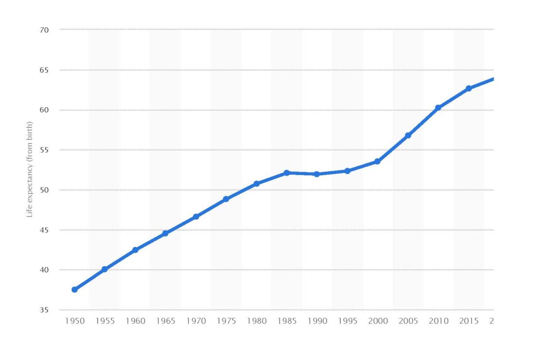 Figure 5 – Life expectancy in Africa, 1950-2020 (Source: Statista)
The kink in life expectancy around the end of the 20th century is mainly due to the spread of HIV/AIDS. Future blogs will focus on the consequences of declining fertility. These include changes in the age distribution (population pyramids) due to changes in fertility and contributions from immigration. I will also look at some of the economic consequences of declining populations and their impacts on the political leadership of some countries that will hold key elections in 2024.