I am on the faculty at both CUNY Brooklyn College and the CUNY Graduate Center in Manhattan. CUNY is a huge institution:
The City University of New York is the nation’s largest urban public university, a transformative engine of social mobility that is a critical component of the lifeblood of New York City. Founded in 1847 as the nation’s first free public institution of higher education, CUNY today has 25 colleges spread across New York City’s five boroughs, serving 275,000 degree-seeking students of all ages and awarding 55,000 degrees each year.
I am scheduled to teach three undergraduate courses in the Fall 2020 semester, all of which focus on climate change. All three include both background and research components. I am also directly involved in implementing Brooklyn College’s mandate to become a carbon neutral facility by mid-century. Two of the three courses will research the similar NY State and City mandates to convert the state to carbon neutral by the same time (see last week’s blog and the June 4–18, 2019 blogs).
We still don’t know how next semester will play out. Whether we teach remotely or on campus (or alternate between the two) will depend on higher authorities—especially the status of the coronavirus within New York. We are using the summer to improve our remote teaching skills.
I want to look here at how we can use the lockdown to better understand Brooklyn College’s energy structure. Fortunately, we already have some data that can be of use.
During my single approved visit to the campus since the mid-March lockdown—to collect some papers from my office and that of my wife—I was struck by the beauty of the empty campus on a lovely spring day. I was also struck by the wasteful mid-day use of air conditioning and lights with hardly anybody around.
I forwarded my impressions to our Director of Environmental Safety and she responded that she was aware of the issue. She said that, “Facilities did go through the buildings and turn things (AC, lights) off where possible/access. However, some building utilities could not be shut due to IT closets, animals, chemicals, etc…” The CUNY central Office of Sustainability and Energy Conservation immediately followed her statement with a short communique including three graphs of Brooklyn College and CUNY energy use from mid-March through the end of May. I am including both the graphs and the attached explanations here:
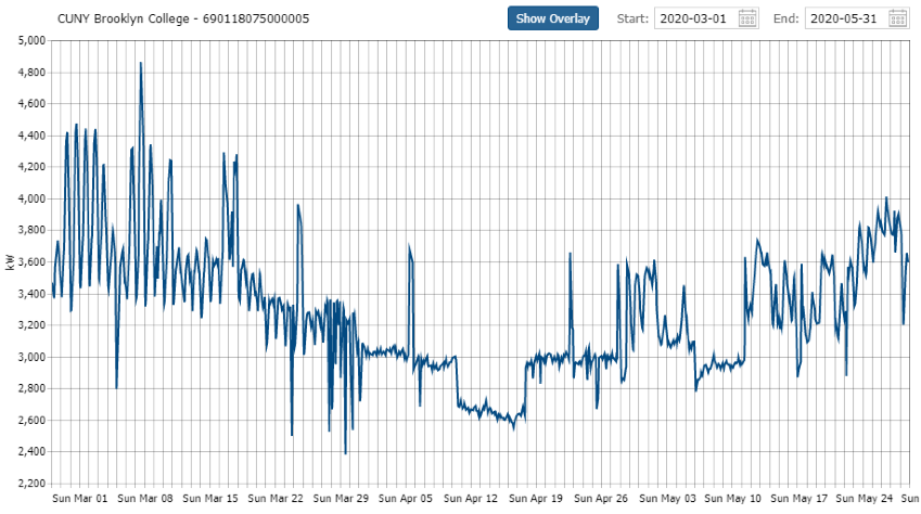
Figure 1 – Brooklyn College energy consumption during the lockdown
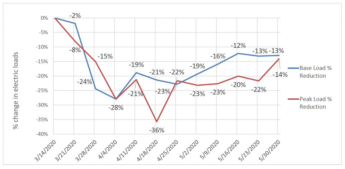
Figure 2 –Brooklyn College reduction in base and peak loads of electricity used during the lockdown
All CUNY colleges achieved reductions in Base load and Peak load Demand during COVID-19 reduced occupancy. These graphs show reductions from a March (pre-COVID) Baseline. The Baseline is an average of Demand (kW) over the first 2 weeks of March.
Here’s what you need to know about peak loads and base loads:
Peak load is a period of time when electrical power is needed a sustained period based on demand. Also known as peak demand or peak load contribution, it is typically a shorter period when electricity is in high demand.
Base load, on the other hand, is the minimum amount of electrical demand needed over a 24-hour time period. Also known as continuous load, base load requirements do not change as much.
Figure 3 shows the schematics of base load and peak load on a daily basis:
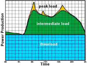
Figure 3 – Illustration of base load, intermediate, and peak load
The base load roughly corresponds to nighttime energy use and anything above it corresponds to intermediate load or peak load. However, weekends in many business places see demand that more resembles an increase in base load throughout the day and corresponding reduction (or shift) in peak load with an overall reduction in load. In that sense, the coronavirus lockdown should resemble most businesses’ weekend demands.
All three figures show power use. We convert power use to energy use by multiplying the power by the time; we can do this by measuring the areas under the curves. That’s much easier to do with the base load than with the peak load (the curve is usually simpler). In order to calculate the average reductions in base loads and peak loads throughout the time periods, we add the reduction %s in Figure 2, and divide the sum by the number of periods. The results come out as a reduction of 17%/week for the base load and 21%/week for the peak load at Brooklyn College.
We can then compare these to the corresponding numbers in NYC at the zenith of the pandemic (April 16th—see the June 2nd blog). The reduction in electricity use during that day compared to the amount used on the same day in 2019 was approximately 20%. Considering the differences between the two sets of data (baselines of one year vs. several months prior, datasets of one peak day for NYC vs. 6 weeks average for Brooklyn College), the similarities are almost too good to be true.
One of the focal points for students analyzing these kinds of data is to figure out what actual activities are responsible for the base load and the peak load and where we can institute saving. For instance, can we identify how much power goes toward A/C in nonessential buildings?
Next week, I plan to put forward some suggestions on how we can save energy once we get the data.