My wife and I start our day with breakfast and the print edition of The New York Times (NYT). When the paper arrives, we split it between us—she gets the front section and I get the rest. One of the first things I look for in the paper is the Weather Report—specifically, the global temperature listing shown in Figure 1. I am not looking for the weather in New York City. I get that information in a much timelier manner from one of the weather applications on my electronic devices. Rather, I want to see the global picture. What am I searching for? This time of the year I am looking at places with temperatures higher than 100oF and monitoring how long those heat waves last. The Weather Report in Figure 1 shows three cities in the US with temperatures consistently higher than 100oF: El Paso, Phoenix, and Tucson.
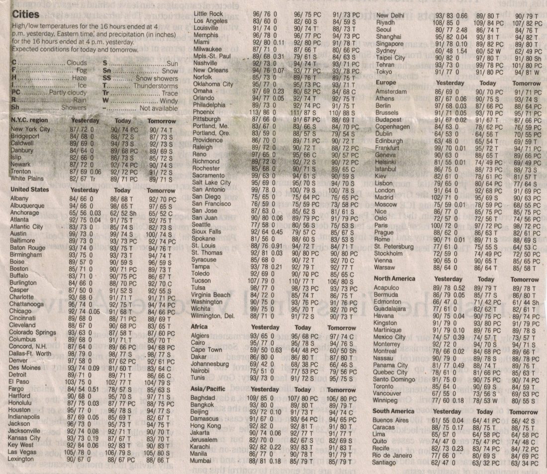
Figure 1 – The daily global temperature listing in The New York Times Weather Report
Brooklyn College’s academic year starts in a few weeks. I’ll be teaching three courses, each of which discusses climate change on some level. I have recently started to examine ways to use the NYT Weather Report as a teaching resource. I’ve been counting how many consecutive days the temperature stays above 100oF and I am starting to think about the heat index in these places (July 3, 2018 blog). With temperatures of 100oF and humidity (not given in the weather index) reaching between 40% and 100% in El Paso, the heat index in these cities can range between 109oF and 136oF. With prolonged exposure and/or physical activity, such a heat index can amplify danger. This includes instances of muscle cramps and heat exhaustion, as well as much more dangerous heat strokes. In other words—the whole range can be summarized as unlivable. I have a dear friend in Tucson (the editor of this blog) but she and her family are largely able to stay out of the heat. Others, including “essential” workers or those who live from paycheck to the paycheck, cannot. As I mentioned last week, such circumstances are also at play with coronavirus exposure right now.
Another way to analyze this database is to count the number of cities in each continent with temperatures above 90oF. The list provides three columns of temperature: yesterday, today, and tomorrow. A heat wave can be any event with three consecutive days of temperatures above 100oF.
The key is to get a sense of the time-dependence of some of these trends. Since my semester is a bit longer than three months, my students and I will spend about a third of it analyzing such trends.
It is obvious that the data set shown in Figure 1 is a biased one. It emphasizes NYC and the US, and a somewhat arbitrary selection of cities worldwide. The list shows more than 80 cities in the US, which has a population of 330 million, while it only mentions 7 cities in Africa, which has 1.3 billion people. So, any analysis to indicate a global trend has to be based on the same continental analysis that the report provides. One of the most important consequences of this bias is that—as with any data set—to make it useful, we must use the same parameters throughout our study and not change (or supplement) them. Our analysis also has to be sensitive to some properties of the planet. For instance, while it’s the height of summer in the northern hemisphere, it is winter in Australia and in South America. Obviously, we will not look for 100oF or 90oF temperatures in the winters.
The New York Times Weather Report, as we see in Figure 1, is somewhat simplistic. It’s certainly not up to my usual standards. It also bounces around between the paper’s sections. I tried to find the data set online and convert it to a nice figure. No such luck. I spent some quality time on the NYT application with no result. I suspected that for one reason or another, it might only be in the print edition. But, while I was able to find the print edition online, the Weather Report was not there. A more intensive search in the Replica Edition didn’t help. I finally found a note about the phenomenon in a meteorology course in the New York Times inEducation section:
Finding the weather forecast today on the internet or through apps is easy for just about any location on earth. However, what about getting the forecast on one page for a cross-section of the major cities in the U.S. as well as around the world? The internet and apps would require a lot of data entry. What about the level of the NYC reservoirs or whether or not the current month’s temperature and precipitation are above or below normal and other environmental data?
The New York Times print edition provides this information every day. It is not available on-line. But if you can find a duplicate copy of the in-print “Weather Report” on line, you will be rewarded with 100 extra points in this lab, not at http://www.nytimes.com/weather?8qa
I don’t honestly understand the reasoning here, nor the challenge to find something that likely doesn’t exist. If the information is already compiled for the print version, why not just publish it online with a date?
In any case, I want my students to follow the data set for one month, to clearly indicate the parameters that they intend to follow (such as the examples that I gave earlier) and write down the information with the corresponding date. Afterward, they will submit a graph with the related information as a function of time and draw conclusions from the graphic presentation.
The New York Times provides many resources for teaching and learning. It also offers free or discounted subscriptions to students and faculty in many eligible schools. It is obvious that the paper cares for education. I will try to take some steps to convince them to digitize the Weather Report. In spite of its time-dependent nature, publishing the data online would give better access to most and provide a valuable educational resource.
Next week I will try to continue my virtual discussion of The New York Times by examining their learning sections. I hope to communicate to them my desire to incorporate the Weather Report.
The effects of global warming has increased, we should definitely take necessary actions asap.
I’m from Russia, and I’ve been monitoring the weather there for couple of years, and I can really see that the temperature is not the same anymore. When I was 10, the temperature could be -30C in winter. Now it’s rarely -20C. I think global warming is a huge issue, and something should be done as fast as possible.