I started this series (February 20, 2018) by introducing energy-related indicators for the ten most populous countries (with the addition of two African countries that are projected to join those ranks by 2040). I aim to use these indicators as markers for the ongoing energy transition, revisiting them periodically to inform us on our progress. Hopefully they will also demonstrate steps that can better prepare us for this transition.
The selected twelve countries represent more than half of the world’s population, as well as the full spectrum of economic wellbeing as characterized by GDP/Capita. These tables include only one fully developed country – the US. Most of the other countries are still struggling to offer their citizens the standard of living already enjoyed by richer countries. To balance my checkup on global progress I have also included the performance of five small, wealthy countries that have the resources to mitigate the environmental impact of their energy use. In almost all cases the indicators were represented on a per-capita basis so that we could quantitatively compare different countries regardless of their populations.
Selected indicators include population (from the UN), GDP/Capita (from the World Bank) and the energy and emissions statistics from the most recent British Petroleum (BP) review.
The BP site also features a section on regional impacts that includes projections for 2040 energy indicators. Among those regions are: Africa, Brazil, China, the European Union, Indonesia, the Middle East, Russia, the UK, and the US.
I will try to summarize the series of indicators by using two methods: the first is to encapsulate the global perspective via graphic representation. Second, I will include a direct comparison between BP’s projections for the energy indicators of China and the US in 2040. In a previous blog (February 27, 2018) we saw that China and the US now account for 43% of global carbon emissions. So what these two countries do in the near future is of prime importance from the global perspective.
Figure 1 shows regional non-hydro renewable power generation as compiled by The Economist.
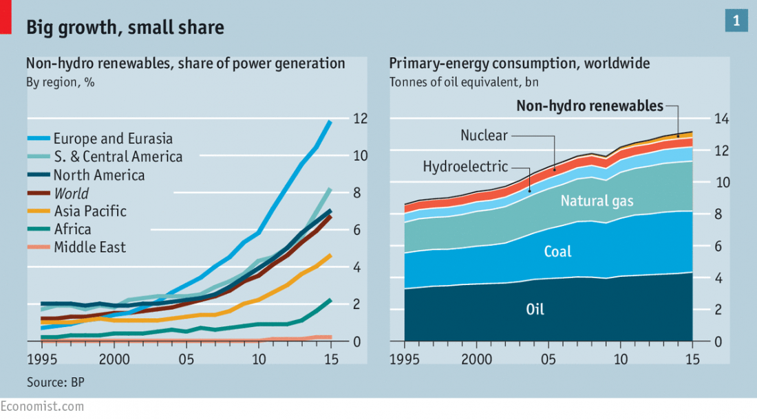
Figure 2 shows a broader picture of global power generation by energy source, as compiled by the US Energy Information Administration (EIA).
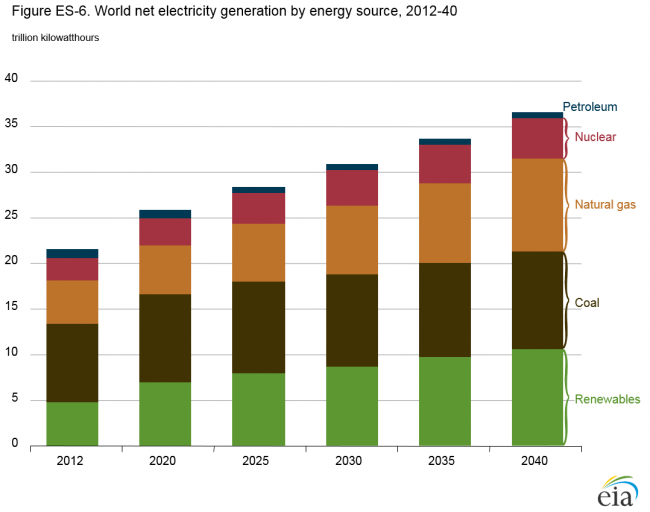
Figure 3 shows a detailed examination of distribution of renewable energy use by the countries within the European Union. Here again, The Economist is sourcing its figures from the BP database.
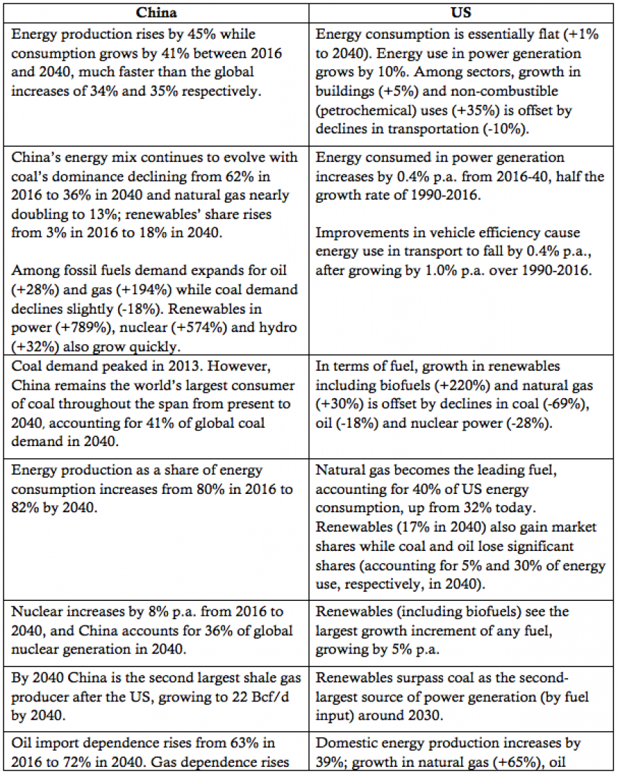
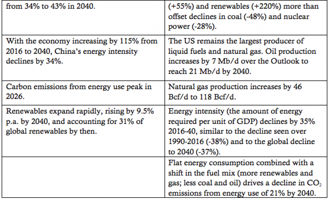
The two tables below show direct comparisons between BP’s projections of the energy transitions in China and the US.
Table 1 – Summary of 2040 projections of the US and China’s energy indicators
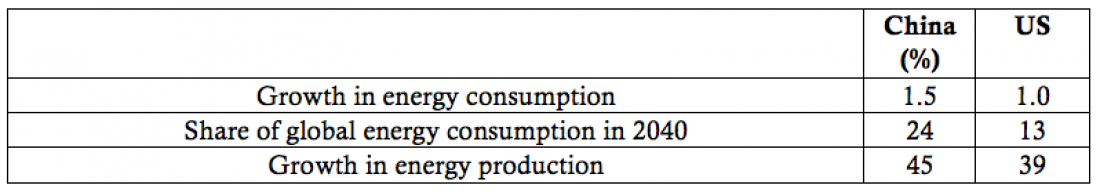
Table 2 – Trends in 2040 projections of the US and China’s energy indicators