One of the biggest shocks of the Tokyo 2020 Olympics was Simone Biles’ historic withdrawal from several events. Her teammates expressed solidarity with her decision and she received a lot of positive feedback globally for placing her health above her career. Meanwhile, her absence in those events left room for other gymnasts in the top spot, and her teammate Suni Lee won the all-around competition. After her win, Lee thanked her family, friends, and ethnic community for their support but faced criticism for not mentioning her country:
After Suni Lee pulled off a stunning triumph in the women’s all-around gymnastics competition at the Tokyo Olympics, she declared her gold medal a victory for her family, her Hmong community and herself. She pointed to the larger context of all that brought her to that moment and responded with gratitude, especially for her father, who was paralyzed after falling off a ladder in 2019. But notably, she omitted America.
I thought that it was time to try to quantify the role of the collective in individual wins.
This summer, we are witnessing three major global events: the Olympics, a global pandemic that continues to kill millions, and increasingly intense climate change that threatens human existence. The collective or state plays a critical role in all three. Since I started this blog nine years ago, I have talked a lot about the state’s role in climate change. For the last two years, I have also worked to correlate COVID-19 with our confrontation of anthropogenic climate change. Like the pandemic, we already know the causes of climate change, we just need to establish and follow global mitigation strategies. Climate change accelerates based on our carbon dioxide emissions, most of which correlate with our energy use and how we source our power. This is a social and economic problem as well as an environmental one. We can summarize the contributing factors with the IPAT identity (November 26, 2012):
There is a useful identity that correlates the environmental impacts (greenhouse gases, in Governor’s Romney statement) with the other indicators. The equation is known as the IPAT equation (or I=PAT), which stands for Impact Population Affluence Technology. The equation was proposed independently by two research teams; one consists of Paul R. Ehrlich and John Holdren (now President Obama’s Science Adviser), while the other is led by Barry Commoner (P.R. Ehrlich and J.P. Holdren; Bulletin of Atmospheric Science 28:16 (1972). B. Commoner; Bulletin of Atmospheric Science 28:42 (1972).)
The identity takes the following form:
Impact = Population x Affluence x Technology
I went into more depth on the impact of energy use on carbon dioxide emissions later (February 24, 2015):
Figure 2, taken from the latest IPCC reports, shows the relative contributions of the four terms with the carbon intensity of energy defined as CO2/energy summarizing the last two energy terms. The balancing act of the socioeconomic terms with the energy terms is clearly visible, resulting in increased emission with the increased contributions from the socio-economic terms, dominated by the increased affluence of developing countries. The increase in emission associated with the first two terms of the equality is only partially compensated by the energy terms.
As bleak as these numbers can get, this identity can also apply to more enjoyable global happenings, such as the Olympics. It can take the following form:
Number of medals per country = population * (GDP/Capita) * (Sports/GDP) * (Athletes/Sports) * (Medals/Athletes)
Where Sports/GDP represents the fraction of the country’s GDP allocated to sports, Athletes/Sports represents the size of the country’s athletic delegation and Medals/Athletes represents the fraction of their athletes that won medals.
I can abbreviate the last identity as Medals = Population*Affluence*Olympics or MPAO.
This is called an identity because in all three cases, denominators cancel numerators to leave identical terms on the left- and right-hand sides of the equation. Figures 1, 2, and 3 present diagrams from my favorite visualizing site: Visual Capitalist. They identify the three key elements in the MPAO identity, giving us an instant understanding of the global distribution of these terms.
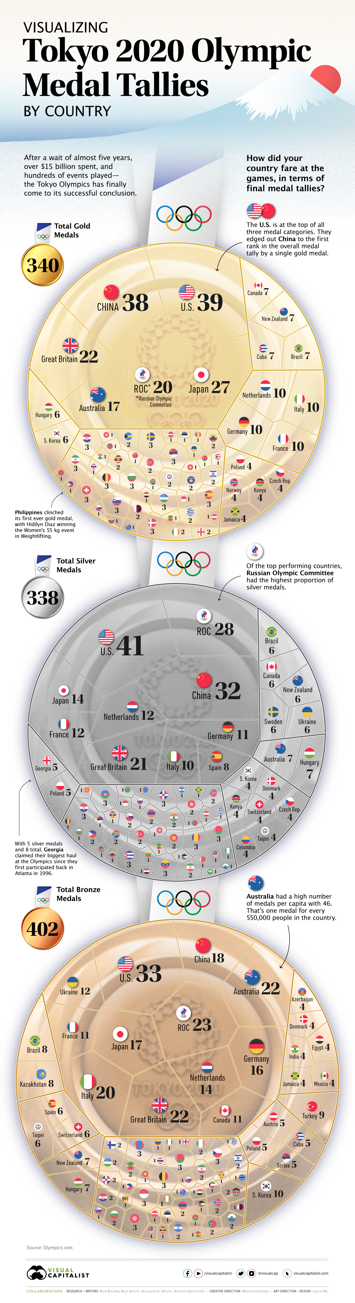
Figure 1 – Distribution of medals in the Tokyo 2020 Olympic
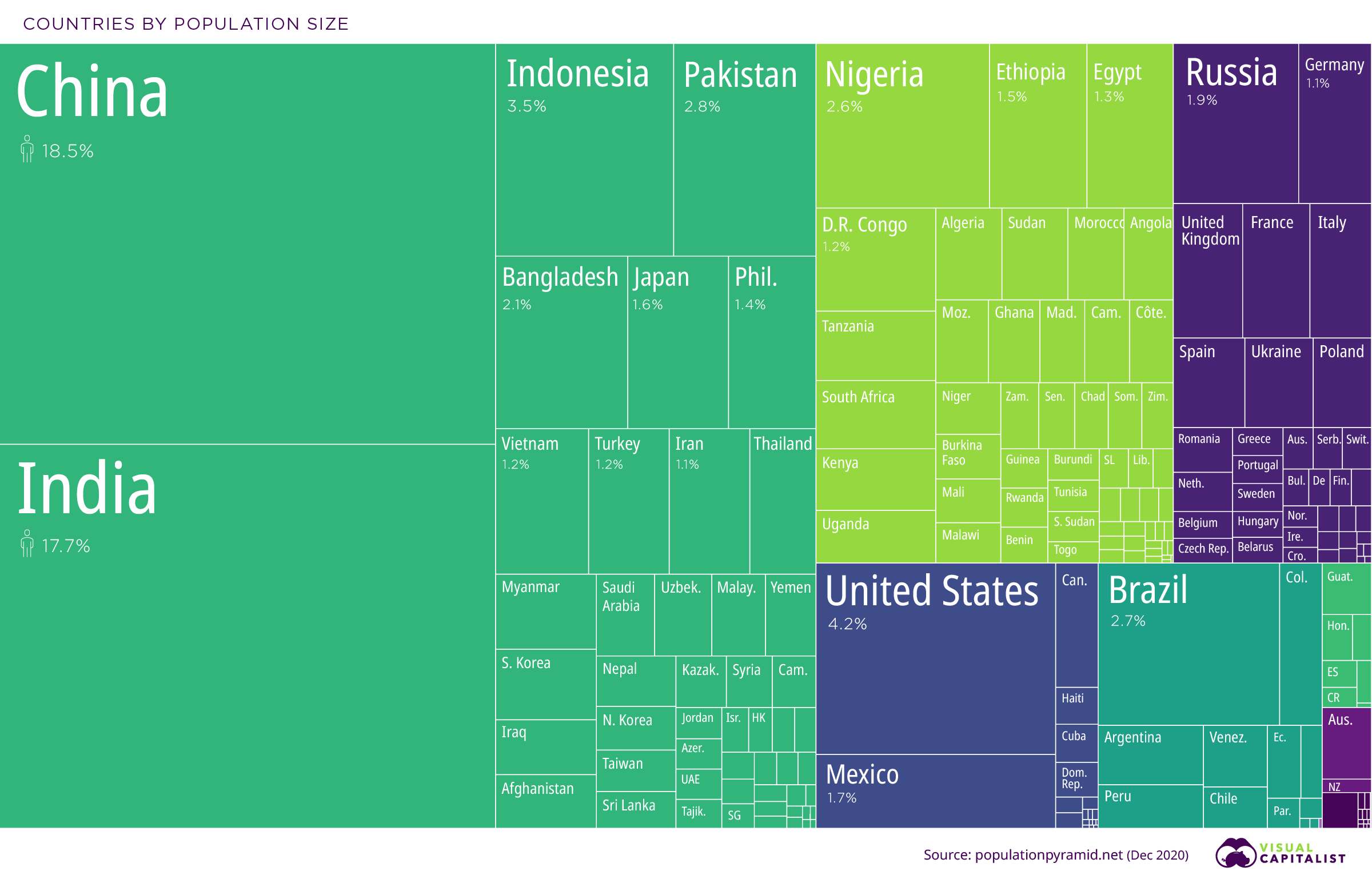
Figure 2 – Distribution of Global Population
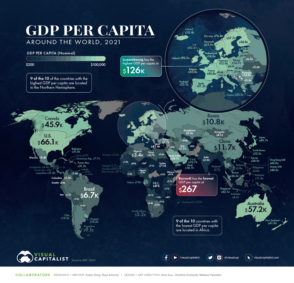
Figure 3 – Global distribution of GDP/Capita (Affluence)
I have constructed Table 1 to provide all the terms in the MPAO identity for the 10 countries that got most of the Olympic medals in the Tokyo 2020 Olympics. I took the first three indicators in the identity from the figures above and found the number of athletes from each country from this Insider article. The (Sports/GDP) was the term for which I had the most difficulty finding data. Most of the data for this term in Table 1 come from a 2008 factbook from the OECD (Organization for Economic Cooperation and Development). Its data for sports and recreation expenditures is even older (2005). The site distinguishes between household and government expenditures but most seem to be the former. Since neither China nor Russia is a member of the OECD, I found a Bloomberg article for China’s sports expenditures. The numbers are consistent with those from the OECD. I couldn’t find a similar site for Russia but the country has a Sports Ministry. I did find the budget of that office but as a fraction of Russia’s GDP, it came out almost an order of magnitude smaller than that of the rest of the countries. Not being able to verify this with other sources, I left this entry for Russia empty.
I am not the first to look into the correlation between the resources that a country dedicates to sports and its competitive successes in international competitions. Several social scientists have addressed the issue before.
Table 1 – Distribution of medals among top 10 countries

This table suggests that, within a factor of two, the efficiency of the athletic delegation, in terms of the number of medals per size of the delegation, is approximately constant. In other words, the more people you send, the more likely you are to get a medal—but it costs money to train those athletes. The actual amount put aside for the Olympics specifically is based on shaky data; great improvement in data for this category is essential before we can draw any other conclusions. That said, the fact that 8 out of the 10 top medal gatherers are rich countries strongly suggests that state support in one form or another is essential.
I wrote about the 2016 Rio Olympics while they were happening (September 8, 2016). At the time, I paid special attention to immigration and the definition of state in the context of the Olympics, where many athletes can “choose” which state to represent. This remained an issue in the Tokyo Olympics (see the Israeli baseball team). The medal distribution was also similar. The major medal winners listed in Table 1 are almost the same as those from the Rio Olympics, with the exception that the Netherlands has since replaced South Korea in the top 10. This time, South Korea ranked 15th, with a total of 20 medals. I suspect the outlay from these countries was and remains much higher than many of the lower-scoring countries. More than 200 countries participated in the Tokyo Olympics but the 10 countries in Table 1 took home 54% of the total medals.