Last week I strayed a bit from my series about the markers of our global energy transition, in which I have examined 15 populous countries in three income groups. When possible, I have used data from the World Bank. This particular dataset spans from the year 2000 to 2014, the last year for which I was able to find all the required data for all 15 countries.
Today, I am returning to my original format to examine carbon footprints over the same period and summarize what we found in the last few blogs. Again, the data are from the World Bank and are shown in Figures 1-4. All four graphs present the data in terms of the ratio between carbon footprints (in kg of carbon dioxide) and primary energy (in kg of oil equivalent). I labeled this ratio carbon intensity.
Figure 1 shows global carbon intensity. It rises through 2011, with a dip between 2008 and 2010, and falls again starting in 2012. The overall rise is a modest 6%, as compared to a global GDP growth of 40% in constant US$ (2010 value) over the same period of time.
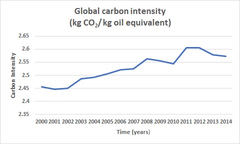
Figure 1
This last decline in global carbon intensity coincided with a 6% rise in global GDP in constant US$ from 2012 to 2014. In short: less CO2 output along with higher GDP. That means that globally we are making progress.
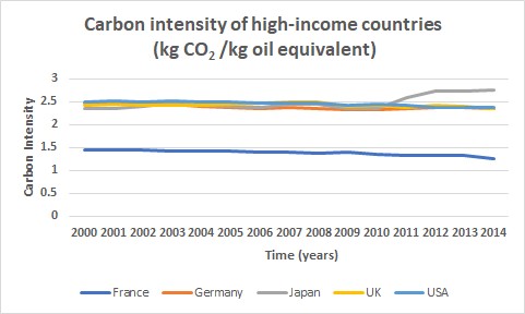
Figure 2
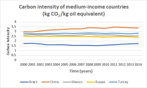
Figure 3
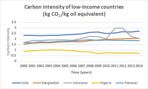
Figure 4
To summarize the last few blogs (from October 15th), two main indicators for the energy transition have emerged: electricity intensity (kWh/kg oil equivalent) and primary energy use. Both have major impacts on the carbon footprints of the three income groups that we see here.
Electricity intensity (October 15th blog) in the high-income category, grew by about 15% while the primary energy use (October 22nd blog) declined over this period. In the United Kingdom, it declined by 25%; in Japan and the US, it was by 15%.
In the middle-income category, we saw a sharp rise in electricity intensity in China (64%) and a smaller rise in Turkey (29%). The other three countries in this category showed approximately flat trends. However, these countries showed major increases in the use of primary energy, with China at the top (+150%) and the four other countries in the category increasing by lesser amounts.
We saw a sharp rise (67%) in the electricity intensity of low-income countries India, Bangladesh, and Indonesia, while Nigeria and Pakistan show a flat trend. In terms of primary energy use, India and Bangladesh showed increases of up to 50%. Meanwhile, Indonesia has risen by around 20%. Nigeria and Pakistan have also risen, albeit by considerably smaller numbers.
Electricity access in the low-income group of countries is far from universal; most of the changes in electricity use in these countries has very little to do with environmental considerations. Instead, it reflects an increase in GDP, which gives them the resources to extend electrical access. I’ll talk about this issue separately next week.
In the meantime, last Monday the US gave a formal notice to the UN of its intention to withdraw from the 2015 Paris agreement. The withdrawal will be finalized a year after this notification, on November 4, 2020—one day after the 2020 presidential election. By that time, the US will be the only country in the world not to participate. Under the agreement, the US had committed to reduce its carbon footprint by 26-28% by 2025, compared to its 2005 output. In 2014, the US had already reduced its carbon footprint by 16%, using the same metrics. The US also promised in the agreement that it would contribute 3 billion US$ to the Green Climate Fund (see the June 20, 2017 blog), an entity that was designed to facilitate climate mitigation and adaptation in developing countries. Two days before President Obama left office, he was able to transfer $500 million as the second installment of the contribution, leaving the US 2 billion US$ short of its commitment. Meanwhile, in addition to quitting the agreement, President Trump is trying to get that one billion US$ back.
Stay tuned!
The data you provided from the World Bank comparing the ratio between carbon footprints and primary energy is very intriguing. I’m interested in how we can use this data and use techniques from around the world to decrease our carbon footprint in the US. What is the difference between the actions of the US and of say France? It would be very interesting to see a global take on the similarities and differences in how different countries used their energy and manage their carbon footprint.
Thank you for this interesting and informative blog. It is very appalling to think that after the withdrawal from the Paris Agreement that the US will be the only country that is not a participant. Especially after we already made progress with a 16% lower carbon footprint in 2016. Is it expected that the US’s carbon footprint will rise following the withdrawal from the Paris Agreement?