In an earlier blog (August 4, 2020), I presented anthropogenic climate change, COVID-19, population, jobs, and equity as circles in a Venn Diagram. COVID-19 gives us an opportunity to quantify those relationships. In this case, jobs represent the economic impact of the global disasters. The economy that will result from the pandemic is unclear but there are several common predictions, which Figure 1 demonstrates.
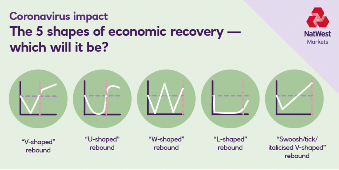
Figure 1 – NatWest’s letter-shaped economic recovery models
While this collection uses the letters L, U, V, W, and a “swoosh” to describe the potential shapes of our economic recovery, it is notably lacking the letter K. In the K model, one arm goes up and one arm goes down, indicating a massive increase in inequality.
Figure 2 illustrates several uneven indicators from the past year. As with other disasters, recovery and adaptation to COVID-19 has involved winners and losers. The winners in Figure 2 are shown in light green, the losers are shown in light blue. In a linear graph representing these trends, the winners rise up one “arm,” while the losers split off to form a downward “arm.” Almost all of the indicators in the figure are focused on stock markets and “investment opportunities,” reflecting the fact that its intended audience is people who have money to invest.
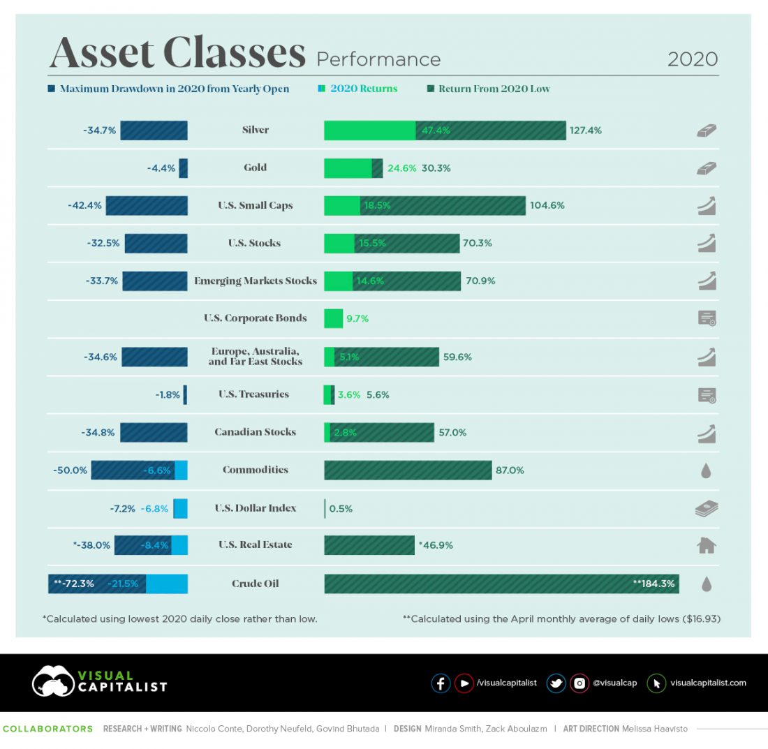 Figure 2 – Asset performances in 2020
If we focus exclusively on the stock market, we see a rise in the values of those companies which have made a lot of our lives bearable during the social distancing of the pandemic (many in the tech sector). Tesla’s stocks increased by a factor of more than 7 over 2020, Amazon by more than 70%, Apple by 77%, Facebook by 30%, Microsoft by 37%, and Alphabet (Google) by 28%. Zoom, which many of us rely on completely for work, increased by a factor of 4. Netflix increased by more than 50%. Interestingly, the developers of the vaccines that offer the best hope for ending the pandemic do not all follow the same upward path. The small companies saw a meteoric rise: Moderna’s stock rose by a factor of 4.5, BioNTech by more than a factor of 2. However, the values of the big companies associated with some of the vaccines, such as Pfizer and AstraZeneca, hardly moved.
Of course, the stock market is not the economy. Figure 3 shows that until the pandemic, the GDP had been rising at an almost constant rate. At the start of the pandemic, life came to an almost stand-still; in less than 2 months, the GDP fell by more than 10%. Partial adaptation started around mid-April, and the GDP responded by rising to its approximate level from two years ago.
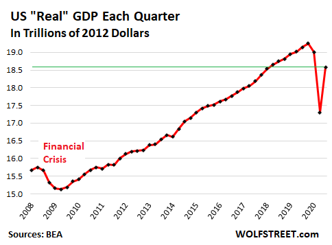
Figure 4 shows a K structure on another level. While employment for college-educated people hardly changed, unemployment grew by about 25% among people without college education.
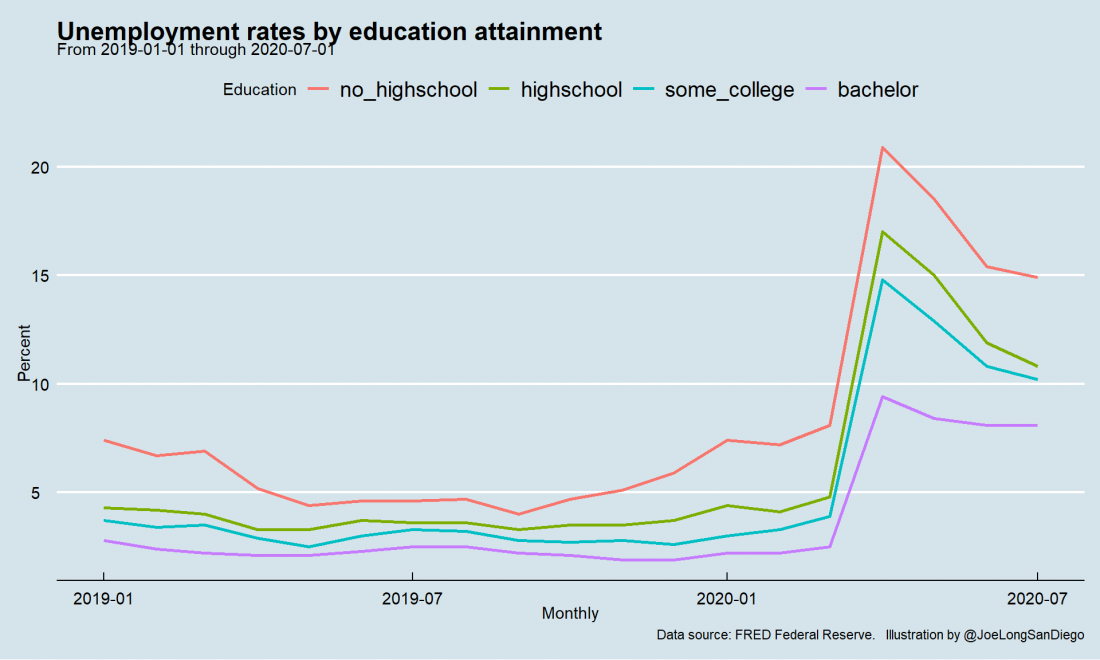 Figure 4 – US employment during COVID-19 by education attainment
All the data I have cited above has focused on the US. Figure 5 shows that the increase of inequality during the pandemic has been global and reproducible. I have discussed the Gini coefficient as a measure of inequality before (August 4, 2015). As I mentioned then, a Gini coefficient of zero indicates maximum equality, whereas a Gini coefficient of 1 indicates maximum inequality. In Figure 5, the Gini coefficient change is expressed in % and it indicates that globally, inequality is rising as we move away from pandemic events.
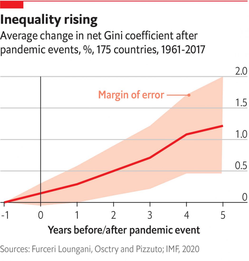 Figure 5 – From The Economist Espresso: Unequal impact: inequality after the pandemic
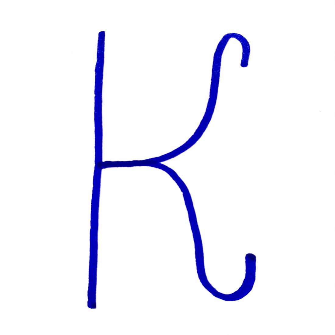
As the stylized letter at the top of the blog implies, the post-pandemic K shape of the future is not a simple, sans-serif letter. The elegant curves of the letter’s two arms eventually move in toward each other, minimizing the inequality.
Almost any major economic or social transition involves winners and losers. The losers try to block the transition while the winners try to accelerate it. To a large degree, the success or failure of such a transition depends on our ability to reallocate some of the winners’ gains to the losers. I used two examples of such impacts in earlier blogs, both of which connect to climate change. In France (see the Dec 18, 2018 blog), the Yellow Vest demonstrations tried to stop—and succeeded in slowing—the transition to the use of more sustainable energy sources. In Germany, on the other hand (October 8, 2019), the government combined its commitments to withdraw from coal with subsidies to the coal-producing states, resulting in minimal objections to the transition.
I will continue to present additional examples, including cases where there is a downward trajectory that some are falsely (and catastrophically) trying to present as a K transition.
Stay tuned.