 Like many others, I stayed up late on Tuesday evening to watch the election results. Like them, my wife and I went to sleep not knowing the end results of the election but sure about two things: the Democratic landslide that some had predicted didn’t materialize and the polls that had us expecting a Democratic presidential victory of more than 90% were dead wrong.
This semester I am teaching two classes. One is a General Education course on climate change and includes 50 students. The other, Physics and Society, is for 5 senior physics majors. Most of us came to class Wednesday morning with the emphasized knowledge that it is incredibly hard to predict the future. For me, this was a teachable moment.
Between last Wednesday’s classes and my next Gen Ed class on Monday, things changed rapidly. On Saturday, almost all of the networks called Pennsylvania for Biden and everyone except for President Trump and some Republicans acknowledged that Biden had won the presidential election. As things stood on Sunday morning, neither Georgia, Nevada, nor Arizona had been officially called but each maintained small leads for VP Biden. North Carolina and Alaska, also uncalled, had leads for President Trump (in Alaska by a large percentage).
I get my election information from Five-Thirty-Eight. From the counts so far, the site projects that Biden will win the popular vote by 4.3% (more than 75 million vs. over 70 million). We expect the total number of votes to be 160 million, compared to 138 million in 2016 (an increase of about 16%). This year about 239 million Americans were eligible to vote (an increase of around 12% from 2016).
Parallel to the election, pandemic cases in the US last week exceeded 100,000 (by Friday it passed 130,000 cases) per day and will likely continue to rise as the third wave buffets the nation.
We use measurable data from the past in order to extrapolate the future. This is especially true when we aim to demonstrate the impacts of climate change. Last year, in its “Learning Network” section, The New York Times, reprinted 24 figures from earlier articles in order to illustrate some of the many aspects of climate change.
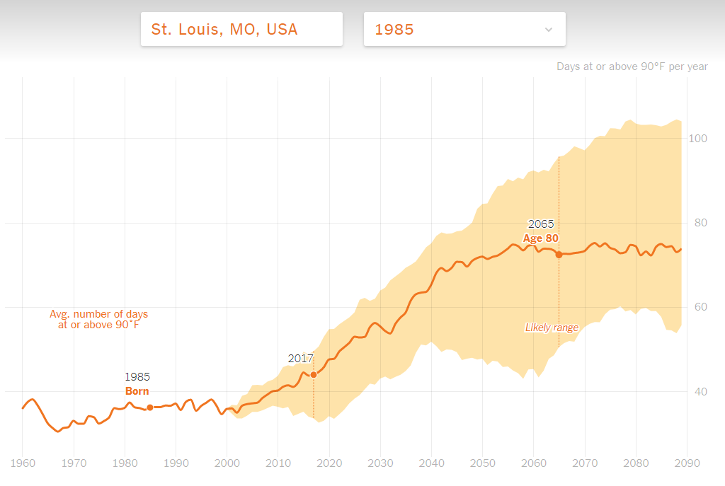
Figure 1 is the graph that I think probably best illustrates the whole theme:
 Figure 1 – How Much Hotter Is Your Hometown Than When You Were Born?
The graph illustrates an exercise that I often do with my students. The original 2017 version of the paper (link provided in the 2019 NYT piece) challenged readers to figure out the change in temperature where they were born by monitoring the number of days above 90oF in that place from 1960 till now. Figure 1 shows the example of someone born in St. Louis, MO in 1985. I tried the site for myself and my wife but we are both too old. The graph starts in 1960 and neither our places of birth are included.
The graph reflects the difficulty of figuring out the future by way of the orange shape that surrounds the line. It depicts the uncertainty in estimating the heating (number of days above 90oF), based on different modeling, and therefore how we measure the impact of climate change in that particular location.
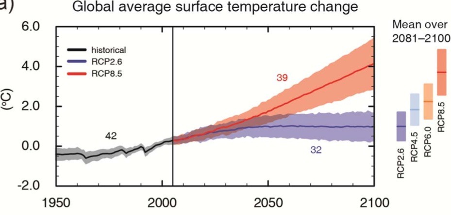
Figure 1 is not too different from the more “professional” one presented by IPCC that I discussed in my October 14, 2014 blog and have reposted here as Figure 2. It shows the divergence between the past and future of global temperature based on a “business as usual” scenario (RCP8.5) and the most optimistic, “environmentally friendly,” scenario (RCP 2.6). I discussed the connections and uncertainties between the orange and purple bands in my May 16, 2017 blog.

Figure 2 from the October 28, 2014 blog
I also looked at the methodology of measuring aspects of the climate through number of heatwaves: number of days with temperature above 90oF in a particular location (“Do-It-Yourself Climate Monitoring,” August 18, 2020 blog).
The senior physics course, “Physics and Society,” includes two group research projects. One involves a projected addition to the latest congress-mandated periodical intelligence report (see Global Trends – 2035). The other project focuses on future pandemics that might result from ancient viruses released by melting permafrost. The uncertainty in predicting the future is paramount in both projects.
Throughout the more than 8 years that I have been writing this blog, the uncertainty involved in trying to predict the future has stood out as a key element. By January 5th, we should know not only the full count of the presidential results but also those of the Georgia senate runoff, which will tell us the “final” composition of the senate. Since Biden’s win of the presidency is now recognized by almost everyone, we will be watching to see whether or not he follows through on his promise to rejoin the Paris climate change agreement the day after his inauguration see the set of blogs starting in November 3, 2015). As a reminder, President Trump’s announced withdrawal from the Paris accord took effect last Wednesday, a day after the election.
Stay tuned.

I mean predicting the outcome of something is never going to be a 100% possible that’s why it’s called a prediction, it’s destined to change depending on the factors. I think that the high probability of one’s guess not being spot on is the most admirable thing about predicting something because it leaves gateways for future improvements and acknowledgments. It gives us the opportunity to reconsider and grow.
Figure 1 is very useful to see the effects of climate change on a place that is personal to each person. I input my own information into the site and received a personalized graph. My birthplace of Dębica, Poland, received an average of 16 days of at least 90 degrees F, and it now receives an average of 18 days of at least 90 degrees F.
I’m sure you both applaud this exchange of facts. It’s a useful blog. This is a cozy one. Superb workplaces. Nice jobs. Nice work.