I am starting this blog on Friday, February 6th, the day of the opening ceremony for the winter Olympics. Put Olympics into the search box of this blog and you will get 17 blogs from previous years. I like to watch and comment on these events. In almost all of these, the events that I have enjoyed the most are the Parades of Nations that are at the center of all Olympics. I watched the event on Friday. More than 90 “nations” are taking place in this Olympics. Most of them are sovereign states; some of them are not (Hong Kong, Macau, Puerto Rico, etc.). The number of athletes in each delegation varies from 1 to more than 250. Almost all combinations of ratios between a nation’s population and its number of participating athletes (or delegates) show up, starting from macro nations with micro delegations (India) to mini (not micro) nations with macro delegations (Switzerland and all the Scandinavian countries) and most permutations in between. Almost every delegation works hard to look different in their winter coats, but the faces of the athletes look the same – young and happy. Through this lens, the world looks like a great place to be part of.
The last Olympics which I wrote about was the 2024 Summer Olympics in Paris. I used the blog (August 20, 2024 blog) to correlate the medal distribution of the 10 largest medal earners with the 10 most populated countries. To do this, I compiled the socio-economic data of the 10 most populated countries, which are responsible for more than 50% of the global population and 50% of global GDP. This table was marked as Table 1 in that blog. I am using it again here (marked as Table 2) to correlate the Olympics with the change in leadership that is now taking place in global energy use.
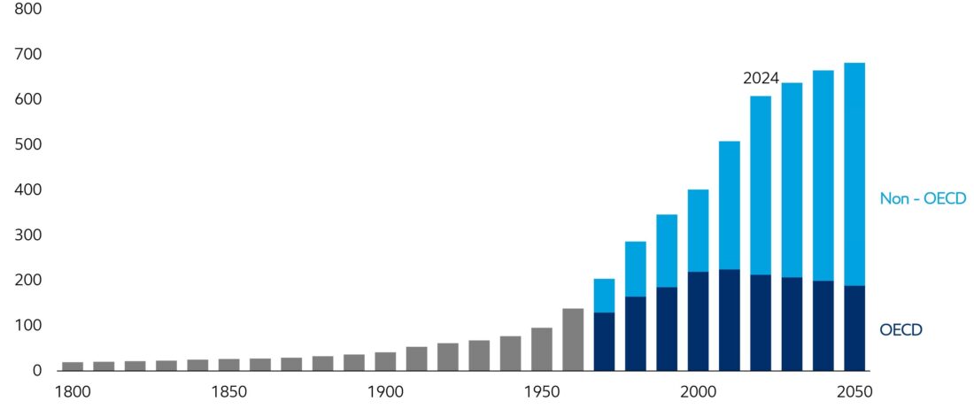
Figure 1 (Source: ExxonMobil)
Figure 1 shows the global energy demand, compiled by ExxonMobil Outlook from 1900 until 2050, based on the following assumptions:
The global population is projected to rise by > 1.5 billion people by 2050, a 20% increase from today, and nearly all of that growth will occur in developing countries. Over that same time period, global Gross Domestic Product (GDP) is projected to nearly double, with developing nations growing twice as fast as developed nations. By 2050, the developing world will account for more than half of global GDP, up from about 40% today. The combination of 1.5 billion more people and a global economy that is projected to nearly double in size drives about 25% higher energy use in developing countries in 2050 versus today.
The basic finding of this estimate is that the non-OECD countries will sharply increase their energy consumption compared to the OECD countries, where OECD stands for Organization for Economic Co-operation and Development. It includes 38 countries (OECD – Wikipedia), which describe themselves in the following way:
The majority of OECD members are generally regarded as developed countries, with high-income economies, and a very high Human Development Index.
Membership in the OECD follows this process:
Following a request by a country to begin the process, the OECD Council decides whether to open accession discussions. The Council then adopts an Accession Roadmap for the country setting out the terms, conditions and process towards membership. In line with the Roadmap, up to 25 OECD expert committees engage in a series of technical discussions with a view to agreeing on recommendations as to how the country can best align with OECD standards and best practices.
The World Bank classifies countries as “developed” or “developing” countries, depending on their GNP/Capita. GNP stands for Gross National Product; the related GDP stands for Gross Domestic Product. The difference between GDP and GNP is described as follows (Google AI):
Gross Domestic Product (GDP) measures the total value of all goods and services produced within a country’s borders, regardless of the producer’s nationality. Gross National Product (GNP) measures the value of goods and services produced by a country’s residents and businesses, regardless of their location.
In this blog, I will not differentiate between these two.
Table 1 shows the development designation of the world’s countries and Table 2 is a copy of Table 1 from the August 20, 2024 blog that describes the world’s 10 most populated countries with some relevant socioeconomic indicators.
Table 1 – Income designations by the World Bank
| Designation | Boundaries US$/Capita | Membership (from Table 2) |
| Low Income | < 1,200 | None |
| Lower Middle Income | 1,200 – 4,500 | India, Pakistan, Nigeria, Bangladesh |
| Upper Middle Income | 4,500 – 14,000 | China, Indonesia, Brazil, Russia and Mexico |
| High Income | >14,000 | US |
Table 2
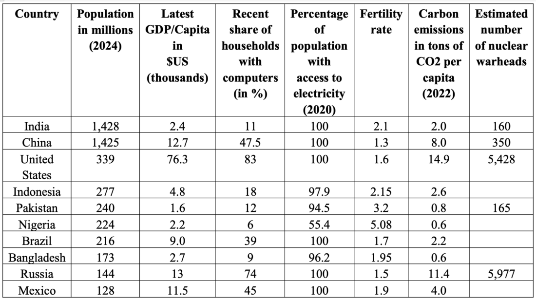
Recent trends in 10 large countries exceeding 50% of the global population (4.5 billion people) and 50% of the global GDP (55 trillion $US). The approximate global population is taken as 8.2 billion and the approximate global GDP is approaching 110 trillion US$ (data were compiled in 2024). Present global GDP is about 120 trillion US$.
Figure 2 shows a compilation of carbon intensity (carbon emissions divided by GDP in units of million tons/trillion US$) over the period of 1870-2050 in a combination of what were labelled as developed and developing countries. This can serve as a visual reference for the decoupling of economic development and carbon emissions discussed in a blog last month (January 14, 2026) on developed countries. The paper was posted in the form of an economic letter by Zoe Arnaut, Oscar Jorda, and Fernanda Nechio, from the Federal Reserve Bank of San Franciso. In addition to Figure 2, the letter includes global carbon intensity (also a good fit to the bell curve) and separate curves for the corresponding carbon emissions and GDP growth. Below Figure 2, I included a few paragraphs that describe the methodology that these authors used. The authors used data from three developed countries: US, Japan, and Germany; and three that they label as “developing” countries: China, India, and Russia. Japan and Germany are not included in Table 2, though there is no doubt that they are developed countries. China, India, and Russia are all included in Table 2, but only India is characterized (through its GDP/Capita and Table 1) as lower-middle income. China and Russia are characterized as upper-middle income. Nevertheless, all the data that were analyzed seem to fit bell-shaped curves.
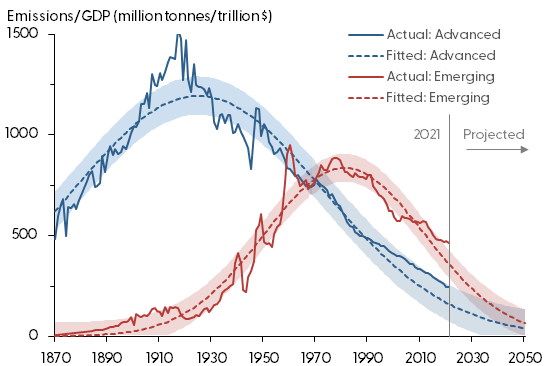
Figure 2 –
https://www.frbsf.org/research-and-insights/publications/economic-letter/2023/10/bell-curve-of-global-co2-emission-intensity/
Excerpts from the fitting methodology:
In this Economic Letter, we use historical CO2 emissions data to evaluate the evolution in the emission intensity of production. This refers to the amount of CO2 emissions per dollar of economic output produced, which can be used as a measure of emissions efficiency. The lower the emission intensity, the more likely countries are to meet their emissions targets given current trends of output growth. In assessing trends in emission intensity, we focus on the six largest carbon-emitting countries, which collectively represent about 75% of world emissions. Three of these countries—the United States, Japan, and Germany—represent advanced economies that developed early in the 20th century with highly inefficient technologies in terms of CO2 emissions. Over time, they have brought down their emissions per dollar significantly. The other three countries—China, India, and Russia—represent emerging economies that went through their industrial transition much later in the 20th century. Because production technologies available at that time had evolved to create less pollution, these three countries now face a quicker path toward cleaner production.
From the global intensity, that gives a single bell-shaped curve.
The dashed line shows the fit from a bell-shaped curve. We create the curve using three parameters that correspond to the peak intensity, when the peak occurs, and how long it takes for intensity to decline from the peak. The shaded regions are 68% confidence bands, which indicate the uncertainty related to the combination of our parameter estimates and how well the curve fits the data. The figure shows that a bell-shaped curve fits the historical path of emission intensity very well, capturing the rise of world intensity up to the 1920s and the gradual improvement since then.
To gain a better understanding of this pattern over time, we turn to more granular data on individual countries. We focus on the world’s six highest-emitting countries, which collectively account for about 75% of global emissions as of 2021: China with 37.88% of global emissions, the United States with 16.53%, India with 8.95%, Russia with 5.80%, Japan with 3.52%, and Germany with 2.23%.
What are bell-shaped curves?
A bell-shaped function or simply ‘bell curve’ is a mathematical function having a characteristic “bell“-shaped curve. These functions are typically continuous or smooth, asymptotically approach zero for large negative/positive x, and have a single, unimodal maximum at small x. Hence, the integral of a bell-shaped function is typically a sigmoid function. Bell shaped functions are also commonly symmetric.
The most important applications of the bell-shaped curve are:
- Gaussian function, the probability density function of the normal distribution. This is the archetypal bell shaped function and is frequently encountered in nature as a consequence of the central limit theorem.
The equation is given below:

e in the equation is known as the Euler number: 2.718281… and has very important applications in mathematics and physics. As can be seen in the equation, it has three parameters (a, b, c) that completely define the curves. One of the three parameters that the authors took is the position of the peak of the curve. The peak can be evaluated after it shows up. Once we have the peak, we can draw the full curve and extrapolate the decline as far as we wish. The tipping point of the energy transition that was previously defined as decoupling the carbon emission from economic development, can be defined here in terms of fixed time.
In earlier blogs we discussed another relationship of carbon intensity. It is an example of an acronym known as IPAT (Impact = Population x Affluence x Technology). Put the term into the search box and scan through the relevant blogs. In particular, pay attention to the blog from September 24, 2024. It expands the use of the term to discuss climate change in an identity shown in Equation 2 below,
(2) CO2 = Population x (GDP/Capita) x (energy/GDP) x (Fossil/Energy) x (CO2/Fossil)
We can rewrite this identity in the following form:
(3) (CO2/Capita)/(GDP/Capita) = Carbon Intensity = (energy/GDP) x (Fossil/Energy) x (CO2/Fossil)
Now, the energy term is isolated on the right-hand side of the equation (3).
From the time dependence of the carbon intensity, plotted in the form of a bell-shaped curve, as was done in Figure 2, one should get the right-hand side of Equation 3, which effectively describes the energy use of the country and can be adjusted by the appropriate governmental authorities to manipulate decoupling of growth policy (GDP/Capita) from emissions policy (CO2/Capita).
I will continue to examine this concept in future blogs.
 Figure 1-
 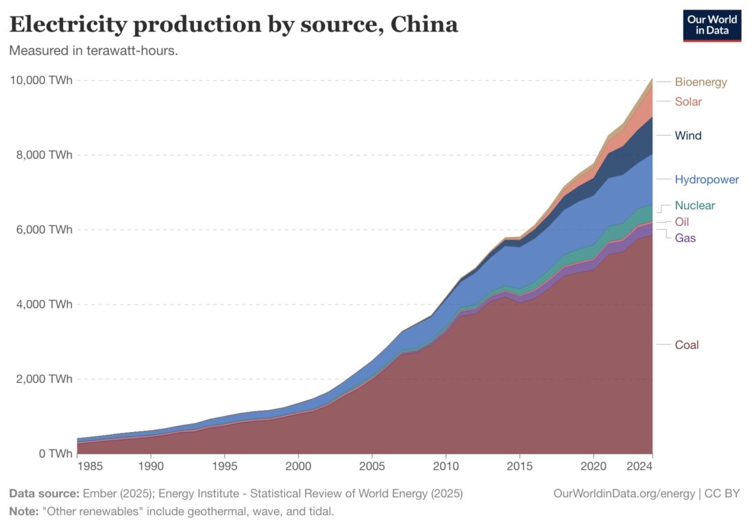 Figure 2 – Graph of China’s electricity production by source, 1985-2024
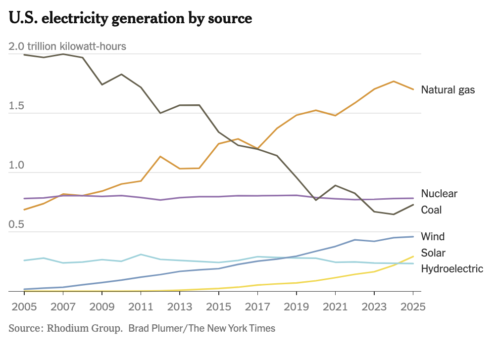 Figure 4 – US electricity generation by source, 2005-2025 (Source: NYT:
 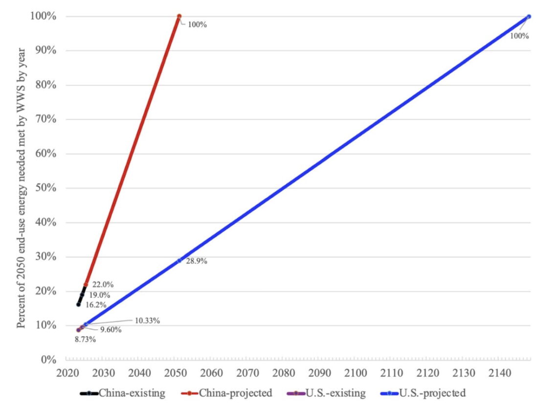 Figure 5 – Rate of energy transition, China vs. US, existing vs. projected
 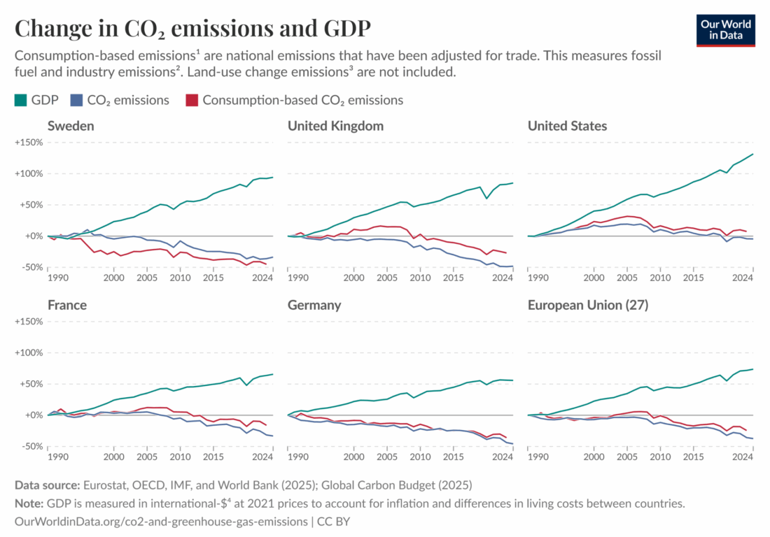 Figure 1
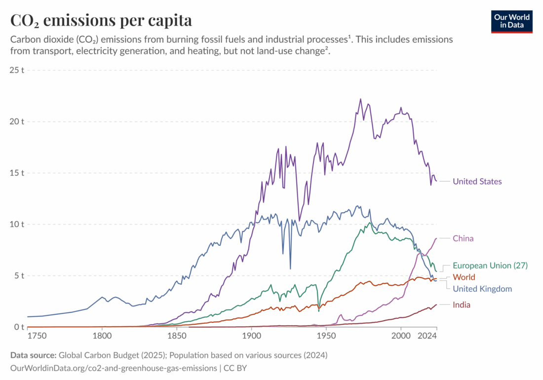 Figure 2
 Figure 3
 Figure 4
 Figure 5
 Figure 6


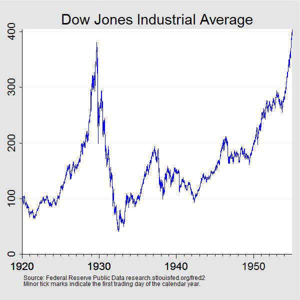 Figure 4 –
 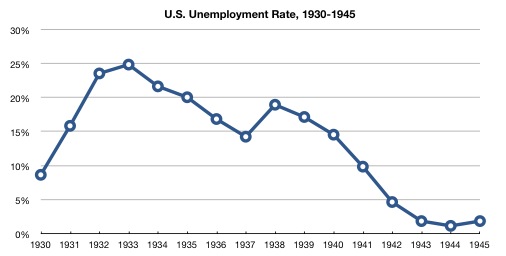 Figure 5 – US unemployment rate, 1930-1945 (
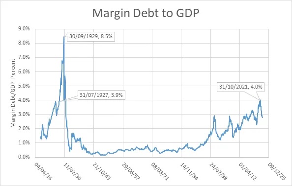

 Figure 1 – Past, now, and future
 Figure 2 –
  (Source: