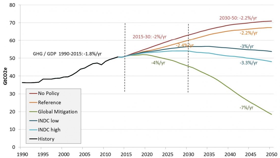
Last week I evaluated the commitments that various countries have made in preparation for the COP21 meeting that is scheduled for the end of this month. Specifically, I looked at the difficulty in converting the commitments from individual countries into practicable (enforceable) global commitments. This transition must include the differentiation between conditional and unconditional commitments while also allowing for the changing variables of population growth, economic growth, rates of energy usage, and the makeup of energy sources. These measurements will mostly come from UN, the World Bank and the European Commission. Almost all of the calculations for building scenarios to accomplish this conversion are anchored on the IPAT identity that I have discussed repeatedly throughout the pages of this blog.
This week and next week I’ll examine an even more fundamental component of the commitments – the measurements themselves. Since the Paris meeting will focus on the future, I will start the discussion with future measurements, largely based on data from satellite monitoring, which is independent of individual countries’ input. I will continue next week with a look at the current uses of this technology, as largely coordinated by the IPCC and the UNFCCC.
The technology for direct global satellite observations of carbon dioxide was recently given a major boost with NASA’s launching of OCO-2, the recent component of NASA’s “Earth Observation Fleet.”:
The OCO-2 Project primary science objective is to collect the first space-based measurements of atmospheric carbon dioxide with the precision, resolution and coverage needed to characterize its sources and sinks and quantify their variability over the seasonal cycle. During its two-year mission, OCO-2 will fly in a sun-synchronous, near-polar orbit with a group of Earth-orbiting satellites with synergistic science objectives whose ascending node crosses the equator near 13:30 hours Mean Local Time (MLT). Near-global coverage of the sunlit portion of Earth is provided in this orbit over a 16-day (233-revolution) repeat cycle. OCO-2’s single instrument incorporates three high-resolution grating spectrometers, designed to measure the near-infrared absorption of reflected sunlight by carbon dioxide and molecular oxygen.
The project is currently limited to two years but we all hope that if successful, it will be extended indefinitely and that other space agencies will expand and double check the coverage.
The data from the satellite observations are being posted on a common site for the GES DISC’s “Earth Observation Fleet.” Below is a section of the site’s front page, including the fleet’s other components.
Here is a short introduction to the data:
An exciting week for us – Sept 6th, 2015 marks one year of operational data collection for OCO-2!
And, we have prepared the year of OCO-2 lite files, with bias correction and warn levels! We will open the portal on Tuesday (9/8/2015) CO2 Data Portal to share those datasets. There is one file per day (much fewer than the standard product), and the number of ancillary data fields are reduced to create smaller files. Documentation will also be on the portal.Key information in the documentation:
– Descriptions of the data fields and organization in the netcdf files.
– For XCO2, we describe in detail the warn levels, which are an indication of the data quality. The user can trade off data quality and data volume by selection of warn levels. See attached for details.
– Also for XCO2, we describe the process used to calculate the bias correction, and provide characteristics of the corrections that were applied. The uncorrected XCO2 and fields used in the correction are all included in the netcdf files.
– The SIF lite file document describes the data fields and corrections that are applied to that product.
As with the L2Std and L2Dia files, there is a collection for the forward processing stream (v7) and the reprocessing stream (v7r), which runs from Sept 2014 through May 2015. The reprocessing data stream has a larger data volume.We are happy to hear your comments and questions – please email oco2_feedback@jpl.nasa.gov
A “typical” example of the data and its corresponding caption as they appear in the NASA publication follows:
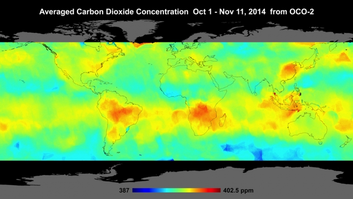 Figure 1 – Global atmospheric carbon dioxide concentrations from Oct. 1 through Nov. 11, as recorded by NASA’s Orbiting Carbon Observatory-2. Carbon dioxide concentrations are highest above northern Australia, southern Africa and eastern Brazil. Preliminary analysis of the African data shows the high levels there are largely driven by the burning of savannas and forests. Elevated carbon dioxide can also be seen above industrialized Northern Hemisphere regions in China, Europe and North America
As we saw in an earlier blog (June 25, 2012) where I discussed the Carbon Cycle in another context, the yearly anthropogenic contributions to the carbon dioxide flux between the atmosphere and the land and oceans are less than 4%. NASA claims that OCO-2, has a high enough resolution to differentiate the anthropogenic contributions from the “natural” background contributions. This capability has yet to be demonstrated.
Follow-up on the terrorist attack:
In light of the terrorist attack on Paris that took place on Friday, November 13, I will try to include an update on the impact that the attack is having on the meeting in every blog.
During this first week, the President of France, Francois Hollande declared that the meeting will proceed as planned. The American government has declared that President Obama will also attend as planned.
However, Reuters came out with the following headline: “Green groups re-think massive Paris climate march after attacks.” This was followed the next day by the New York Times article, “Paris Attacks Hit Luxury Hotels Particularly Hard” which included the following paragraph:
And the United Nations conference on climate change, which is scheduled to begin Nov. 30 and run for two weeks, was expected to bring 40,000 visitors to the city and serve as the hub of countless dinners and receptions. But citing security concerns, the French government has ordered the conference to be scaled back to the bare essentials, resulting in the cancellation of more than 200 planned events around the .
Financially, this will have a huge impact because many “green tourists” that would have attended those events, will instead stay away from Paris. This decision will also have a massive effect on how non-politicians around the world participate, whether that means that they take to social media, demonstrate in other countries, or something else entirely.
I will keep you posted.
 JRC97845_Analysis


 Figure 1
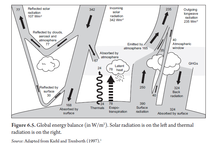 Figure 1 – The Energy Cycle (Figure 6.5 in the book)
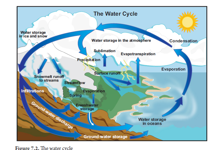 Figure 2 – The Water Cycle
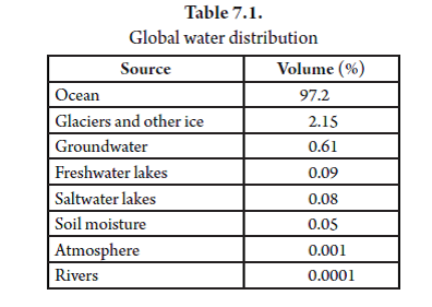 The water cycle is a true cycle in that water is neither being destroyed nor created at any given time (although very small amounts can escape to outer space or the interior of the Earth). There is plenty of water on our planet; the total amount of water on Earth is 1.4 billion km3 (USGS) or about 300 million miles3. This amount is equal to about 20% of the weight of the moon. However, most of this water (97%) is ocean salt water, and is not suitable for either irrigation or consumption by humans or land animals. Solar energy evaporates a little bit of the ocean water, leaving the salt behind, and moves some of it to land where it can fall in the form of rain or snow of fresh water. As a result of this process, only a very small amount of fresh water can be captured to be used between people, plants, and animals. This meager amount is nowhere near enough for today’s use. The World Bank defines water stress as availability of less than 1,700m3/ person. Our planet now houses more than 7.3 billion people, and more than 80 countries are suffering from severe water stress. Most of these countries are poor, but important sections of very rich countries suffer from water stress as well – as is the case with California. I have written extensively (mainly in August – December 2013) on this important issue.