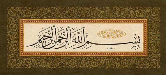
 In the name of God, the Most Gracious, the Most Merciful
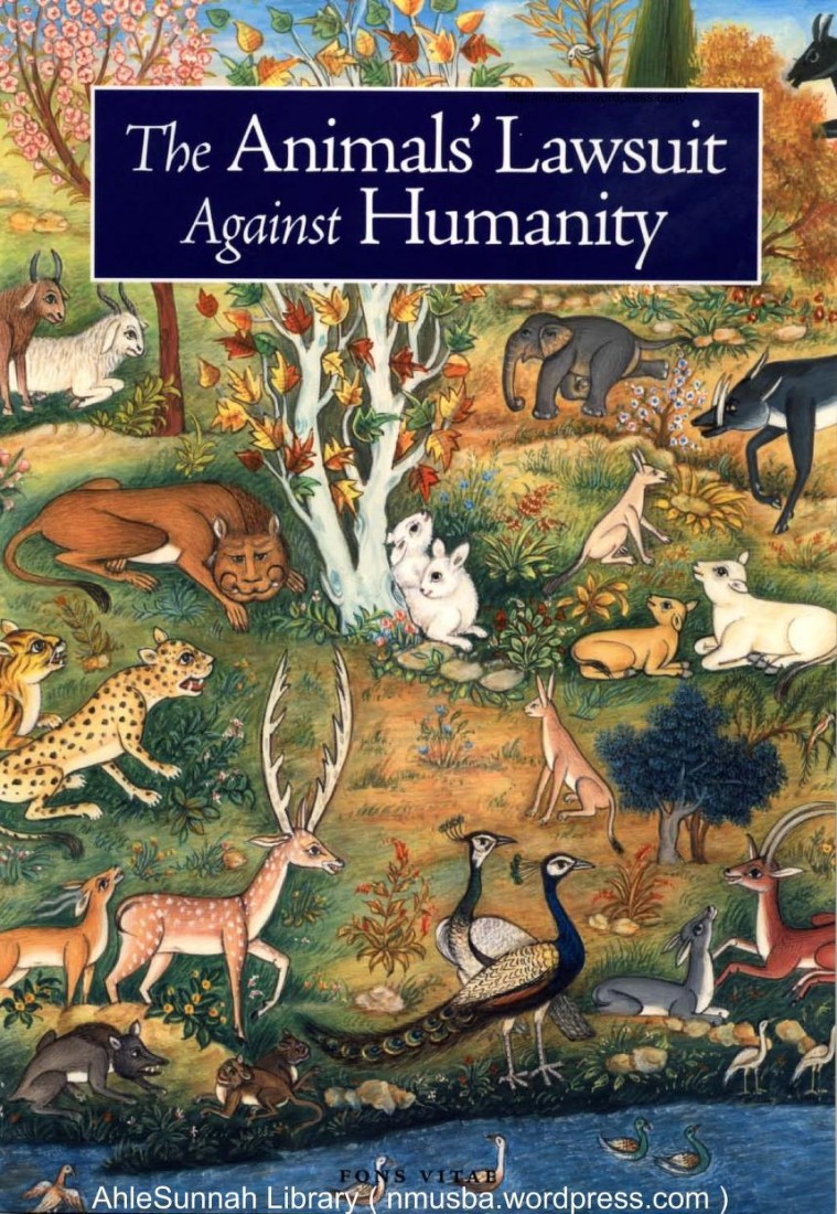
The Animals’ Lawsuit Against Humanity is a 1,000-year-old Islamic tale that examines the conception of Promethean Man and his domination and destruction of the natural world. Embedded within the 22nd Rasa’il (Epistle) of the Ikhwan al-Safa’ (otherwise known to medieval Europeans as the “Brethren of Purity”), this 10th century Islamic fable chronicles a series of fictitious debates in a court of law between various animal species and representatives of the Bani Adam (Children of Adam), that had colonized and settled the island on which the animals lived. Animals such as the jackal and the nightingale bear testimony against the human settlers before the king of the jinn because of their mistreatment at the hands of Bani Adam. While the tale was later translated into Hebrew by a Jewish scholar at the request of Charles of Anjou (a medieval Christian king), the original Arabic version is strikingly beautiful. The language forges poignant connections between the animal welfare concerns of 10th-century Basra, Iraq and the crises of the modern world, namely those related to human-caused global climate change and its grave implications for endangered species and their threatened habitats.
Indeed, as Dr. Seyyed Hossein Nasr notes in his doctoral dissertation entitled, An Introduction to Islamic Cosmological Doctrines, the timeliness and contemporary relevance of this didactic tale lies in its reflection on the universal “lower self” of man and his potential for ruthless destruction irrespective of time. Man, in his hubris and egocentrism, oppresses all that which exists in the natural world with the justification of fulfilling “human needs,” all the while making his “rights over other creatures absolute.”1 Dr. Nasr argues that this hubris has always existed but became particularly emphasized and popularized with the rise of Renaissance humanism and the “idealization of Promethean man” in the contemporary era. What is interesting about The Animals’ Lawsuit Against Humanity is that the animals successfully counter each of the arguments the human settlers present to excuse their actions; however, the “possibility of a number among men to attain sanctity and therefore to be able to act as the channel of grace for the rest of God’s creation” serves as the ultimate reason for the jinn king’s refusal to punish all of Bani Adam for their transgressions against nature. But this divine pardon rests on one condition: man must strive to fulfill his God-given responsibility of being a viceregent on Earth (khilafat Allah fi’l-ard), a major mortal function described extensively in the Qur’an, by first overcoming the “self-aggrandizement” and hubris that compelled him to disregard the well-being of the animals in the first place.
 As observant Muslims worldwide prepare for the Islamic holy month of Ramadan 1436 AH, we are reminded of our collective responsibility to protect and cherish the amana, or trust, of the Earth given to us by God in addition to caring for our fellow human beings. During the “month of mercy,” all able-bodied adult Muslims abstain from food, drink, and marital relations from dawn to dusk in a sincere effort to increase piety and taqwa, or God-consciousness. Many nights are spent in deep meditation and prayer. It is tradition for observant Muslims to complete and reflect on at least one reading of the Qur’an (“The Recitation”), which Muslims believe is the final and unaltered revelation from God to the Prophet Muhammad (upon him be peace and blessings) in a long series of divinely-inspired books revealed to other honorable messengers like Moses, Jesus, and Abraham (peace be upon all of them) as divine guidance for their respective peoples. As God declares in Surat Al-Baqarah (Chapter Two) of the Qur’an:
O you who have believed, decreed upon you is fasting as it was decreed upon those before you that you may become righteous – [Fasting for] a limited number of days. So whoever among you is ill or on a journey [during them] – then an equal number of days [are to be made up]. And upon those who are able [to fast, but with hardship] – a ransom [as substitute] of feeding a poor person [each day]. And whoever volunteers excess – it is better for him. But to fast is best for you, if you only knew.2
This Ramadan will be the longest and hottest in my lifetime – in New York City, Muslims will fast for approximately seventeen hours during some of the hottest days of the year. While there are some health benefits involved in the actual act of intermittent fasting (detoxification is just one), the self-discipline involved in going about one’s ordinary day without any food or water is also important. It relates to the idea of conquering one’s ego for the sake of improving one’s character and relationship with God and with others. The purpose of fasting is two-fold; we are taught to become “righteous” people by learning empathy for the less fortunate and we are also taught to subdue the self, which has tremendous implications not only for the way we treat other people but also for how we treat the Earth and other sentient beings like the animals discussed in the fable earlier.
We are reminded of the importance of being just and kind to all and that there is the potential for both great good and great evil in each of us. Moreover, we are taught to appreciate all that we do have – as the Qur’an relates the story of the Children of Israel, God states: “And [recall] when We took your covenant, [O Children of Israel, to abide by the Torah] and We raised over you the mount, [saying], “Take what We have given you with determination and remember what is in it that perhaps you may become righteous.”3 In the same Surah, God declares: “O you who have believed, eat from the good things which We have provided for you and be grateful to God if it is [indeed] Him that you worship.”4 Essentially, fasting becomes an obligation for those who believe in the finality and authenticity of the message of Islam so that they may increase in their remembrance of God and appreciate the mercy He has bestowed upon the human race. Just as fasting allows one to cleanse one’s physical body of impurities it also allows one to reflect on the act of “cleansing” one’s spiritual state. One such avenue to spiritual purification is to refrain from actions that would potentially lead to corruption, such as the “pollution of the environment, depletion of natural resources, and wasteful consumption.”5 In Surat Al-‘A’rāf of the Qur’an, God instructs man to eat and drink in moderation but to not indulge in wastefulness – He states, “O children of Adam! Wear your beautiful apparel at every time and place of prayer: eat and drink: but waste not by excess for God does not love those who waste.”6
In Shari’ah, or Islamic Law, the juristic principle, “there shall be no damage and no infliction of damage”7 is extensively applied to “almost every conduct in dealing with the environment (e.g. matters of land, water use, building construction, waste disposal, and so on)”8 so that the human being remains vigilant of his obligation to care for the Earth, its resources, and wildlife. In other words, this aversion to harm takes precedence over any “acquisition of benefits” and is considered better than the need for remediation after such corruption has occurred.7 This is because the Shari’ah is based on the principle that everything belongs to God and God alone. “People do not in fact own things, for the only real owner of things is their Creator, be He glorified and exalted. Indeed, people do not own anything but their usufruct in the manner permitted by the revealed Law.”9 As such, the right to use private property or environmental resources is a temporary trust given to man with the condition that he makes use of this trust in accordance with its “divinely ordained purposes.”7 And while the attitude of Islam to the “environment, the sources of life, and the resources of nature” is based partially on the prohibition of abuse and selfish exploitation, it is also based on “construction and sustainable development.” It is narrated that the Prophet Muhammad (upon him be peace and blessings) said, “If any Muslim plants a tree or sows a field, and a human, bird or animal eats from it, it shall be reckoned as charity from him.”10 The fourth caliph of Islam, ‘Ali ibn Abi-Talib, once said to a man who had cultivated and reclaimed abandoned land, “Partake of it gladly, so long as you are a benefactor, not a despoiler; a cultivator, not a destroyer.”11 These statements all demonstrate that the aim of preservation and use of the natural environment in Islam is for the “universal good of all created beings,” not just the human being.7
As one of the most famous tales in the Islamic world, The Animals’ Lawsuit against Humanity brings up several issues of great contemporary relevance, especially concerning the current environmental crisis: What are our rights over other creatures and what are the limits to those rights? Do animals have any rights over us? What is the purpose of human life and how can we go about knowing that purpose without trampling on the rights of the rest of God’s creation? Within an Islamic framework, the preservation of the natural environment is known as hifz al-Ard and is considered a primary responsibility of the human being as a khalifa, or steward and caretaker placed upon the Earth by God. Surat Al-Baqarah in the Qur’an mentioned earlier relates the creation of man through a metaphorical conversation between God and the angels. God revealed:
And [mention, O Muhammad], when your Lord said to the angels, ‘Indeed, I will make upon the earth a successive authority.’ They said, ‘Will You place upon it one who causes corruption therein and sheds blood, while we declare Your praise and sanctify You?’ God said, ‘Indeed, I know that which you do not know.’12
And just as the Qur’an is comprised of ayat, or verses, which literally translates into English as “signs, revelations, evidence, lessons, and proofs” of the existence of God and His divine attributes, the natural environment is also thought to contain a multitude of ayat, that point to the existence and the oneness of God.8
The Qur’an warns man against sowing corruption on the Earth and of transgressing against the Divine Law. If man does not observe this warning and deliberately enters a state of ghafla, or heedlessness, he essentially chooses to go against his aboriginal nature of submission to God and commits injustices against his own soul, sins that he will be held accountable for on the Day of Judgment. God’s wrath is incurred as a result of man’s deliberate transgression and concealment of truth. However, God’s mercy is always greater than his wrath. In Surat Al-‘An-‘am, God states,
“And it is He who has made you successors upon the Earth and has raised some of you above others in degrees [of rank] that He may try you through what He has given you. Indeed, your Lord is swift in penalty; but indeed, He is forgiving and merciful.”13
This particular verse is quite striking because it expounds on the transcendence and imminence of God.
While full conceptualization of God is beyond human intellectual capacity, the Islamic tradition holds that human beings can know of God’s existence and His divine attributes through the physical world around us, which is a rahma, or mercy, unto itself. All of creation was formed to “serve the Lord of all beings by performing their ordained roles so as to best benefit each other,” thus leading to a “cosmic symbiosis” (takaful) of sorts.7 Moreover, the Islamic worldview stipulates that God created all things in the universe in due proportion and measure; there is wisdom, value, and purpose in all of creation. As God explains in the Qur’an,
“Verily, all things have We created by measure”14 and “We have not created the heavens and the earth and all that is between them carelessly. We have not created them but for truth.”15 “Indeed, in the creation of the heavens and earth, and the alternation of the night and the day, and the [great] ships which sail through the sea with that which benefits people, and what God has sent down from the heavens of rain, giving life thereby to the earth after its lifelessness and dispersing every [kind of] moving creature, and [His] directing of the winds and the clouds controlled between the heaven and the earth are signs for a people who use reason.”16
If man is to recognize his central purpose in life, then it becomes incumbent upon him to conserve and nurture that which allows him to reach the objective truth in the first place – the natural environment and the sentient beings with whom he interacts. These are all ayat, or signs, for “men endued with understanding.”17
—
For more information on environmental protection in Islam, I highly recommend reading the IUCN (The World Conservation Union) Environmental Policy and Law Paper No. 20 and Syed Iskandar Ariffin’s “Islamic Perspectives and Malay Notions of Heritage Conservation.” If you would like to read the adapted version of The Animals’ Lawsuit Against Humanity, please click here. For a wonderful video lecture on this same topic, please consider watching Shaykh Hamza Yusuf Hanson’s “Sacred Earth: Sacred Self” here.
Notes
- Nasr, xiii. “The Animals Lawsuit Against Humanity – A Modern Adaptation of an Ancient Animal Rights Tale Told Originally by a 10th Century Muslim Iraqi.” The Animals Lawsuit Against Humanity – A Modern Adaptation of an Ancient Animal Rights Tale Told Originally by a 10th Century Muslim Iraqi. Trans. Anson Laytner and Dan Bridge. Ed. Matthew Kaufmann. Fons Vitae, 2005. Web.
- Qur’an, Surat Al-Baqarah (2), ayah 183-184.
- Qur’an, Surat Al-Baqarah (2), ayah 63.
- Qur’an, Surat Al-Baqarah (2), ayah 172.
- Raouf, Mohammad A. “Of Ramadan, Our Bodies and the Environment.” Of Ramadan, Our Bodies and the Environment. Gulf News, 30 June 2014. Web. 8 June 2015.
- Qur’an, Surat Al-‘Ar’āf (7), ayah 31.
- Bagader, Abubakr Ahmed, Abdullatif Tawfik El-Chirazi El-Sabbagh, Mohamad As-Sayyid Al-Glayand, Mawil Yousuf Izzi-Deen Samarrai, and Othman Abd-ar-Rahman Llewellyn. Environmental Protection in Islam. 2nd ed. Vol. 20. Gland: IUCN Commission on Environmental Law, 1994. Web.
- Ariffin, Syed Iskandar. “Islamic Perspectives and Malay Notions of Heritage Conservation.” Asian Heritage Management: Contexts, Concerns, and Prospects. By Kapila D. Silva and Neel Kamal. Chapagain. London: Routledge, 2013. 65+. Print.
- Abu ‘l-Farak ‘Abd ar-Rahman ibn Rajab, in al-Qawa ‘id.
- Hadith of sound authority, related by al-Bukhari and Muslim on the authority of Anas.
- Athar related by Yahya ibn Adam al-Qurashi in Kitab al-Kharaj, on the authority of Sa’id ab-Dabbi.
- Qur’an, Surat Al-Baqarah (2), ayah 30.
- Qur’an, Surat Al-‘An’am (6), ayah 165.
- Qur’an, Surat Al-Qamar (54), ayah 49.
- Qur’an, Surat Ad-Dukhan (44), ayahs 38-39.
- Qur’an, Surat Al-Baqarah (2), ayah 164.
- Qur’an, Surat Ta Ha (20), ayah 54.
—
Sofia Ahsanuddin is a rising senior at the Coordinated BA/MD Program and the Macaulay Honors College at Brooklyn College. A political science major and chemistry minor, Sofia intends to obtain an MD/MPH. Sofia is a Horace W. Goldsmith Scholar and a Rosen Fellow and is interested in learning more about the intersection between state surveillance, governance, health, and human rights. She hopes to specialize in global health and ophthalmology as a physician. In her spare time, Sofia enjoys reading about comparative religion, philosophy, and international affairs.

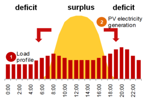 Figure 1 – Typical photovoltaic daily power production and consumption
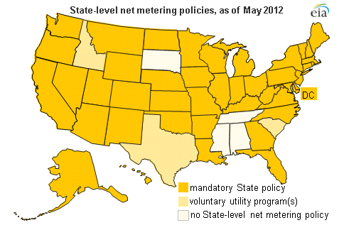 Figure 2 – Net metering requirements across the US
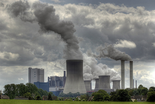
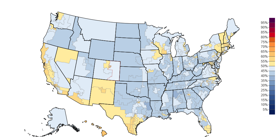
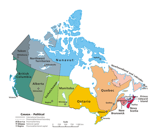
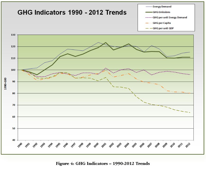 Figure 2 – Greenhouse gas emission and energy use in British Columbia