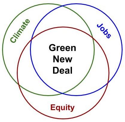
As with most of my blogs, I wrote this one over the weekend (starting Friday). Last week, I looked at the Sierra Club’s Venn diagram of the Green New Deal. I argued that in order to address the near future global trends that we will face in the coming years, the diagram should include COVID-19 and the projected changes in global population. I have done this in Figure 1.
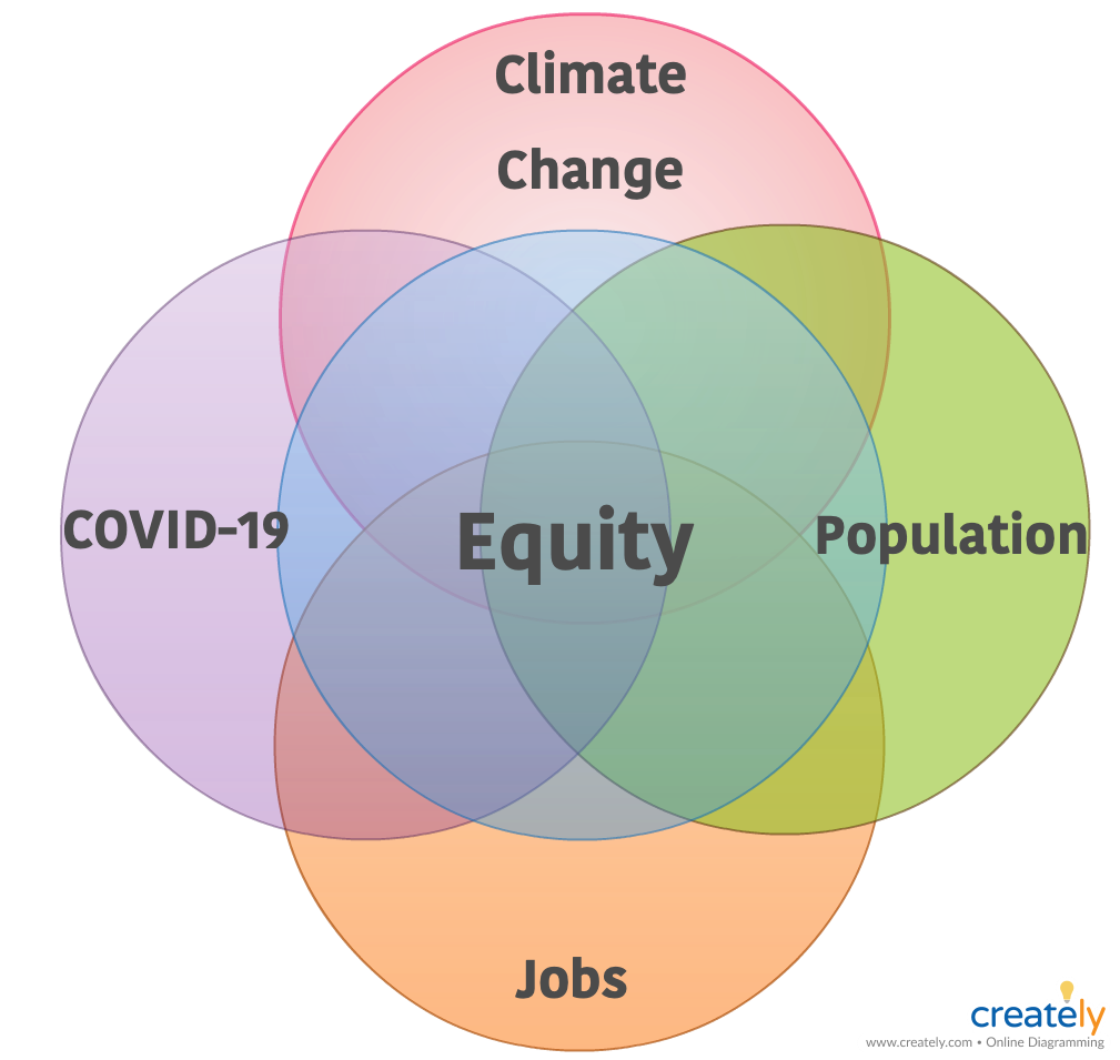
Figure 1 – Venn diagram of expected current and near future global challenges
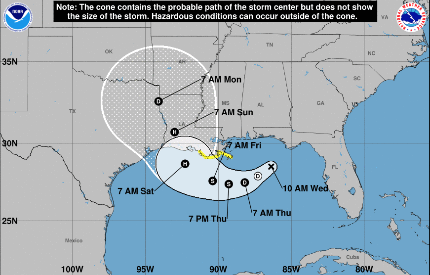
We are clearly witnessing how some of these challenges interact. Last week saw hurricane Hanna beating the southeast coast of Texas. Climate change amplifies and accelerates hurricanes and meanwhile, southeast Texas is currently one of the most concentrated COVID-19 hot spots in the US. People struggled to evacuate while maintaining social distancing. This weekend the picture seems to be repeating itself with hurricane Isaias, which is expected to hit Florida shortly and continue on a path northeast.
Figure 1 shows that all four trends I addressed last week, in addition to being connected to each other, also intersect with a circle that represents equity.
I am using the term equity here because the original Green New Deal refers to it. Equity is a socio-economic indicator that measures the balance/imbalance in poverty and wealth, access to civil rights, and many other elements. I am primarily concerned with global inequities regarding poverty.
Right now, the coronavirus—while a universal threat—clearly highlights the inequities of healthcare in poor countries and access to safety in richer ones. Let’s look at a list of five countries with some of the most severe COVID-19 outbreaks per capita right now.
Table 1 – Ranking of coronavirus cases per capita in 5 countries, as of 8/4/2020
| Country | Cases/1M population |
| USA | 14,747 |
| Qatar | 39,724 |
| Bahrain | 24,520 |
| Kuwait | 16,083 |
| Oman | 15,469 |
The US is the third largest country in the world in terms of population. It’s also one of the richest countries in terms of GDP/capita and the clear leader in overall coronavirus cases (4,884,917). The other four countries in this list all belong to the Cooperation Council for the Arab States of the Gulf. These are small, rich countries, with some of the highest concentrations of COVID-19 cases measured per capita. As in the US, while some people are privileged enough to work from home and maintain social distance, many of the less fortunate have little choice but to keep working in dangerous situations. These countries rely heavily on foreign labor—guest laborers make up almost 75% of their work force. So it is unsurprising that almost all of the COVID-19 cases and deaths there occurred among that concentrated foreign labor force.
Many of the case numbers in individual US states exceed the numbers listed in Table 1 and most of America’s work force lives paycheck to paycheck:
Many people noted that their income would be just enough to cover their bills and basic necessities until the next paycheck comes along. This reflects just how many Americans are living paycheck to paycheck.
Depending on the survey, that figure runs from half of workers making under $50,000 (according to Nielsen data) to 74% of all employees (per recent reports from both the American Payroll Association and the National Endowment for Financial Education.) And almost three in 10 adults have no emergency savings at all, according to Bankrate’s latest Financial Security Index.
The coronavirus has only worsened the situation.
Figure 2 shows the distribution of the impact of COVID-19:
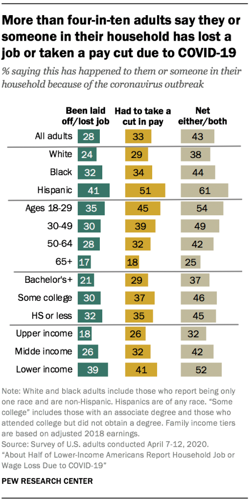
Figure 2 – Impact of COVID-19 on the distribution of the American work force
This means that those in the bottom income brackets (often people of color and immigrants) who still have jobs have no choice but to keep working. Many of these people work in what we deem “essential services,” from grocery stores, farming, and online store fulfillment centers to public transportation and caregiving. We see the overlap between COVID-19, jobs, and inequity here.
In many aspects, the situation in a rich country like the US during this pandemic is not much different from the one in the Gulf states.
We have to absorb the lessons from the impact of COVID-19 to confront ongoing and upcoming disasters, such as climate change and major population decline. Both will strongly affect the age distribution of our work force, likely putting more strain on certain subsets of people and widening existing inequities. Although some places are already experiencing second surges of COVID-19, many developing countries are just now starting to experience the full impact of the first wave of the pandemic. The dangers there multiply relative to impacts on the much more limited health delivery systems, food supply levels, and inability to counteract lockdowns by printing money.
I would not be surprised to see a massive rise in people attempting to move from highly infected areas to “cleaner” ones. Obviously, that won’t work. Coronavirus for some is coronavirus for all. We can’t mitigate the pandemic locally until we mitigate it globally. The same holds true for the longer-range challenges depicted in Figure 1.