Four days ago, the NYT featured Paul Krugman’s op-ed, “Australia Shows Us the Road to Hell,” where he described the urgent situation of the fires now engulfing the entire continent and hypothesized about strategies for confronting the political issues blocking relevant policy changes:
What might an effective political strategy look like? I’ve been rereading a 2014 speech by the eminent political scientist Robert Keohane, who suggested that one way to get past the political impasse on climate might be via “an emphasis on huge infrastructural projects that created jobs” — in other words, a Green New Deal. Such a strategy could give birth to a “large climate-industrial complex,” which would actually be a good thing in terms of political sustainability.
Can such a strategy succeed? I don’t know. But it looks like our only chance given the political reality in Australia, America, and elsewhere — namely, that powerful forces on the right are determined to keep us barreling down the road to hell.
On the front page of the same issue of the NYT, Lisa Friedman wrote, “Trump’s Move Against Landmark Environmental Law Caps a Relentless Agenda”:
WASHINGTON — President Trump on Thursday capped a three-year drive to roll back clean air and water protections by proposing stark changes to the nation’s oldest and most established environmental law that could exempt major infrastructure projects from environmental review.
Paul Krugman warned of political forces on the right and the damage they were doing/could do but even he probably didn’t see that coming.
Depending on the election outcome, it will be either next year or 2025 before we can expect the federal government to be of any help with the issue. In fact, at least for now, the federal government will likely do everything in its power to accelerate the damage that climate is inflicting on the US and the world.
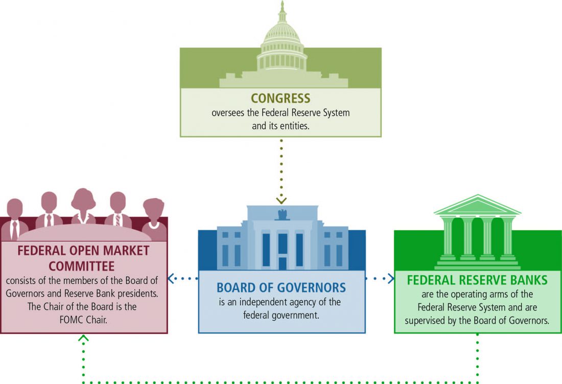
Fortunately, the federal government is not the only one in charge of the money. The Federal Reserve System (also known as the Fed) is the US’ central banking system. It is under Congress—and the Board of Governors that runs it must report to that body—but it is, “an independent agency that makes decisions based on the best available evidence and analysis, without taking politics into consideration.”
In addition, though the Congress sets the goals for monetary policy, decisions of the Board—and the Fed’s monetary policy-setting body, the Federal Open Market Committee—about how to reach those goals do not require approval by the President or anyone else in the executive or legislative branches of government.
The Fed has a large impact on the economy—among other powers, it sets the interest rates and thus directly influences key activities. These include housing (through mortgage rates) and the value of the US currency relative to other major currencies, which impacts both trade and the money available for major infrastructure projects.
 I’m glad to see that it looks like several of the 12 districts of the Reserve Banks that make up the Federal Reserve are taking the impact of climate change much more seriously than the federal government as a whole.
I had never heard of the American real estate blog Curbed before now but I will be rectifying that oversight. One of its articles from October focused my attention on the San Francisco Federal Reserve and how its publication is giving special attention to the present impacts of climate change, “How climate change creates a ‘new abnormal’ for the real estate market”:
A report from the San Francisco Federal Reserve underscores how climate shifts create big investment and economic risks
The publication page for the San Francisco Federal Reserve, part of the nation’s central banking system, isn’t known for light reading. Recent research papers, such as “Yield Curve Responses to Introducing Negative Policy Rates” or “Precautionary Pricing: The Disinflationary Effects of ELB Risk,” aren’t exactly meant to go viral.
But a new set of papers around climate change should gain an audience beyond academic and economic circles. Titled “Strategies to Address Climate Change Risk in Low- and Moderate-income Communities,” this collection of 18 articles by academics and experts collectively offers “one of the most specific and dire accountings of the dangers posed to businesses and communities in the United States,” according to the New York Times.
Other central banks and bankers are taking notice of climate change as well; Since 2017, 46 central banks and regulators have joined the Network for Greening the Financial System, according to the Financial Times, including representatives from China, France, and the United Kingdom. The World Economic Forum’s 2019 Global Risk Report listed three risks of climate change—extreme weather events, failure of climate change mitigation and adaptation, and natural disasters—as both the most immediate and most damaging.
These risks will also affect real estate investments and the operations of the real estate industry, which, despite increasingly grave reports about the impact of climate change on land use and sea levels, has not taken the policy steps and process reviews necessary to deal with the coming challenges.
The special San Francisco Federal Reserve issue of the Community Development Innovation Review addresses how climate change is already impacting the real estate market and offers some detailed advice on how we can adapt:
Without smart, proactive investments in adaptive capacity and resilience, low- and moderate-income (LMI) communities will likely be disproportionately affected by climate change-related events.1 This issue of the Community Development Innovation Review explores these investment opportunities and calls on the community development sector to take a leadership role in preparing vulnerable regions most at risk for a “new abnormal.”2
This issue would not have been possible without the extraordinary work of its guest editor, Jesse M. Keenan. A leading thinker on climate change risk—even adding the helpful term “climate gentrification” to the lexicon—Jesse recruited a remarkable group of thirty-eight authors to write for this issue. Their contributions, and Jesse’s, advance the community development sector and help us better prepare for a changing world.
Despite the challenges that lie ahead, I’m encouraged by the work that’s already begun. As recently as this summer, in fact, the Low Income Investment Fund—a national Community Development Financial Institution—issued a $100 million “Sustainability Bond,” the first public offering directly aligned with the United Nations’ Sustainable Development Goals.3 If that’s any indication, the community development sector has already begun to mobilize capital to address the impacts of climate change in LMI communities.
Nor is the San Francisco Federal Reserve alone. The Dallas Federal Reserve echoed the sentiment:
CORPUS CHRISTI, Texas/ WASHINGTON (Reuters) – Dallas Federal Reserve President Robert Kaplan faced more questions on one particular topic than any other at a recent lunch with local business owners and community leaders on Texas’s Gulf Coast.
Texas has suffered catastrophic floods and billions in related losses in recent years. Now, “it’s hard to meet with a business person or a city or a community leader in this state” who doesn’t have questions on climate change, Kaplan, a former Goldman Sachs investment banker and one of 17 Fed policymakers, said in response to a question at the Sept. 20 lunch.
It’s not just Texas. After devastating fires in Northern California and corrosive storms on the Carolina and Florida coasts, the Fed’s regional banks are delving deeper into how the earth’s warming will impact U.S. businesses, consumers and the country’s $17 trillion asset banking system.
I will keep looking at the economic and social impacts that climate change is fueling on the real estate market, mortgage rate, insurance market, immigration, and the US army.
Stay tuned.

Back to “Self-Inflicted Genocide”: Roger Hallam & the Holocaust
My original plan was to follow up on last week’s blog and look into the recurring complexities of the California fires. In light of the major power outages, some residents have gone so far as to claim that California has lost its capability to support human activity. As happens so often, however, I realigned my priorities based on more recent news. In this case, it was a New York Times article about climate change activist Roger Hallam diminishing the horrors of the Holocaust that brought me up short:
After I read the piece, I looked at my wife and told her to prepare for somebody using my activities on this blog as a reason to fire me from my job. Among other things, I teach students about climate change and specifically describe the future prospects of business as usual climate change as a “self-inflicted genocide.” She looked at me with a smile and assured me she would support me. Furthermore, she said, there was a big distinction between my teaching and Mr. Hallam’s statements, so it was unlikely my job was in jeopardy. For starters, I don’t belittle the Holocaust. Rather, I warn about the ever-worsening impacts of business as usual practices on climate change and their ultimate conclusion without coordinated global mitigation efforts. I thanked her for her encouragement but nevertheless found it necessary to compare myself to Mr. Hallam.
Self-Inflicted Genocide
In my first blog (April 22, 2012), I tried to establish the connections between my own experiences in the Holocaust and my work on climate change. I concluded with the following paragraph:
The last two sentences in that paragraph weren’t the start of my attempt to associate possible future consequences of unmitigated climate change with the Holocaust. It is a theme I have been discussing for over ten years. I have covered it in almost every talk that I have given on both topics and included it in the last chapter of the 2011 book that I wrote about climate change (Climate Change: The Fork at the End of Now – Momentum Press). I started this blog more than 7 years ago as another platform to broaden the reach of my warning. I strongly believe that my background provides me with the responsibility to spread this message.
The first blog provoked 82 responses, which I encourage you to revisit. The sizeable reaction forced me to follow up with more details. The two blogs that followed (May 7 and May 14, 2012) received 63 and 61 responses, respectively.
Today, a search on this blog for the term, “self-inflicted genocide” will yield 23 entries.
Three years ago, a group of students from the University of Pennsylvania who were trying to convince the university’s trustees to stop investing in fossil fuels read some of my material and invited me to take part in a panel about the topic. I joined them on December 1, 2016 to address the theme: Is Fossil Fuel Use A Moral Evil? Following the talk, Chris Doyle, one of the organizers of the event, summarized the arguments in a local paper. I am including some excerpts here:
Reactions
As you can see from the roughly 200 combined comments my first three blogs garnered, this line of comparisons has plenty of proponents and opponents. Nor were the comments and responses confined to the comments section or academic presentations.
I also received copies of three anti-Semitic caricatures in my mailbox at the University. I am including one here to illustrate the depth of Holocaust denial and hatred of Jews.
Figure 1 – An anti-Semitic cartoon denying the Holocaust
It is important to note that, as the Anti-Defamation League (ADL) explains:
My experiences with the consequences of comparing the Holocaust to climate change are different from those that Mr. Hallam is currently facing. I am not in as public or prominent of a position, so I didn’t get the attention of the foreign minister of a major country or cancellations of previous commitments to publish my work. Granted, I also didn’t try to make the comparison based on the actual number of victims. My use of the term self-inflicted genocide refers to the relatively distant future, while the Holocaust refers to a confirmed past event.
That said, any connection between the Holocaust and climate change invokes strong reactions. I am not alone in linking the two—the concluding chapter of Timothy Snyder’s 2015 book, Black Earth: The Holocaust as History and Warning also warns of climate change—but I was one of the first to do so. I also have significant “credentials” with regard to both the Holocaust and climate change.
Figure 2 – Timothy Snyder’s book
International Holocaust Remembrance Day
Two months from now, on January 27, 2020, we will mark International Holocaust Remembrance Day:
As we think about the tragedies of the past, let’s also start planning for ways to prevent those of the future.