In one of my earliest blogs (July 31, 2012), I talked a little bit about the start of my interest in man-made contributions to global climate change. Up until that time my main academic interest was focused on energy use. I grew up in Israel, where energy played an important role in political development: almost all the energy that people used was powered by fossil fuels, a significant amount of which came out of Arab countries that were in a state of war with Israel. Many Israeli scientists worked hard to develop alternative energy sources, reducing the world’s dependence on fossil fuels and their suppliers. Sustainability didn’t play much of a role in these considerations because the resources seemed almost limitless.
Suddenly, in 1992 the world became aware of the impact of carbon dioxide on the climate. The Earth Summit (see the November 3, 2015 blog) and the famous Keeling-Whorf curve (December 1, 2015 blog) of the accelerating accumulation of carbon dioxide in the atmosphere showed CO2 levels to have major impacts on changing the chemical composition of the atmosphere, driving changes in the planetary energy balance with the sun. I spent the next five years after the Energy Summit trying to figure out how I could contribute to the study of this occurrence. In 1996–97 the world press was full of stories that a significant increase in sea-surface temperature affects almost all coral species, leading to global coral bleaching and mortality. Some of the bleached corals were more than 1,000 years old. 1997 was also the National Oceanic and Atmospheric Administration’s (NOAA) Year of the Coral Reef. At that time I had already decided that since the main imbalance in the carbon dioxide concentration comes from our use of fossil fuels, the only way that we can impact these emissions is by shifting our energy sources away from fossil fuels. I was also sure that these changes must be global and include as many people as possible in the decision making process. I started to work on a book to try to explain climate change to the general public, making sure to include descriptions of the bleached corals.
At that time I was already an advanced-middle-aged guy. My wife was younger but not by much. In the summer of 1997 she happened to have a conference in the Yucatan Peninsula in Mexico. I went along. We manage to find the time to take a diving course that gave us a diving certificate. The next year we went to Northern Queensland in Australia to spend a week diving around the Great Barrier Reef.
Figure 1 shows a photograph that my wife took of a bleached coral. The photograph ended up in my book (Climate Change: The Fork at the End of Now – Momentum Press) in the chapter dedicated to early signs.
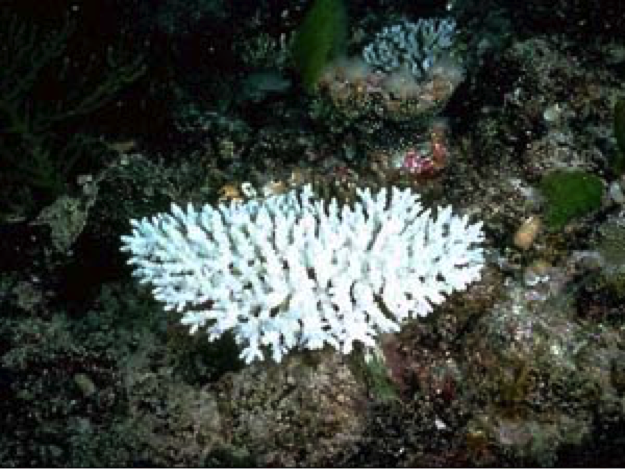 Figure 1 – A bleached coral
Since that time, some of the corals were able to recuperate but then more heat waves came, adding to the carnage.
Two recent pieces from The Economist summarize most of the impact:
The impact of climate change on the Great Barrier Reef
Under prolonged stress corals can expel algae, causing them to starve and die. About a fifth of the reef’s corals died from the 2016 bleaching. In the northern region, where bleaching was most intense, the coral mortality figure was alarming: about two-thirds. Depending on different coral species’ capacity to resist stress, and the distribution of heat patterns through waters, reefs can revive over several years. The difference this time, say experts, is that back-to-back bleaching from two successive seasons of extreme heat have given the reef no time to recover, and have lowered its corals’ stress tolerance. It is too early to measure coral deaths from the 2017 bleaching, but the Climate Council predicts “high mortality rates”.
The second piece examines the long-term history of the impact. It’s based on new research by scientists from the University of Sidney, published in Nature Geoscience:
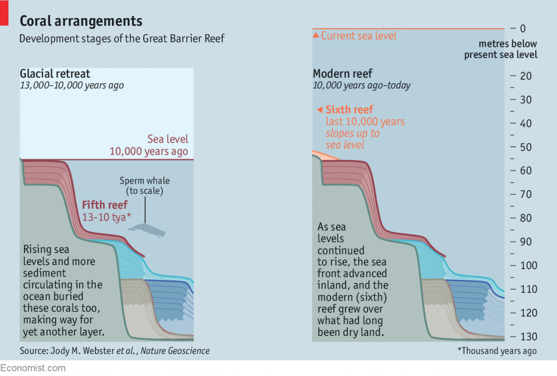 Figure 2
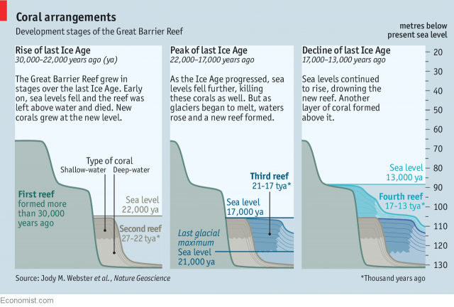
Figure 3
The reality of the Great Barrier Reef’s existence is that it is a movable feast. Reef-forming corals prefer shallow water so, as the world’s sea levels have yo-yoed during the Ice Ages, the barrier reef has come and gone. The details of this have just been revealed in a paper published in Nature Geoscience by Jody Webster of the University of Sydney and her colleagues. The authors examined cores drilled through the reef in different places. They discovered, as the chart shows that it has died and then been reborn five times during the past 30,000 years. Two early reefs were destroyed by exposure as sea levels fell. Three more recent ones were overwhelmed by water too deep for them to live in, and also smothered by sediment from the mainland. The current reef is therefore the sixth of the period.
Figures 2 and 3 show that the history goes back around 30,000 years, and cover the last ice age’s drastic impacts on sea level changes. Following these changes, the corals died when their habitat went dry and revived when the sea levels rose again to create a new habitat. These changes took thousands of years but they show that over a long period of time corals can adapt to major environmental changes. However, none of these previous changes mimic those that we are inflicting upon the oceans now.
Nor are the impacts restricted to the Great Barrier Reef; they are global. Figure 4 shows the global distribution of the thermal stress.
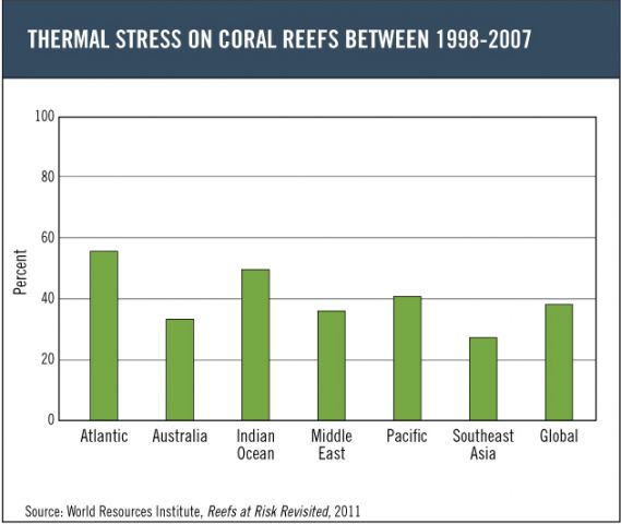 Figure 4
Here is how the World Resources Institute explains this figure:
Mapping of past thermal stress on coral reefs (1998–2007) suggests that almost 40 percent of reefs may have been affected by thermal stress, meaning they are located in areas where water temperatures have been warm enough to cause severe bleaching on at least one occasion since 1998. This figure shows the estimated percentage of reefs per region that experienced thermal stress based on the satellite-detected thermal stress and coral bleaching observations shown in Map 3.2: Thermal Stress on Coral Reefs, 1998-2007.
The stress is not limited to the thermal impact. Acidity changes due to absorption of carbon dioxide in the water inflict stresses of their own that I will cover in a separate blog. None of us will live to see the reversibility of the coral’s decline.

 Figure 1
 Fig. 1